9 search results
(0.021 seconds)
- Arsitage by Maulana Creative,
$14.00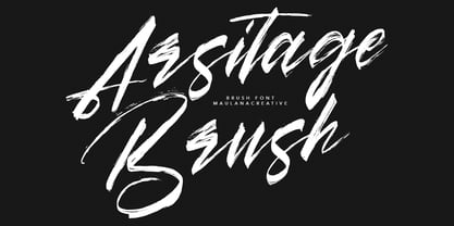 Give your designs an authentic handcrafted feel. "Arsitage Brush Font" is perfectly suited to signature, stationery, logo, typography quotes, magazine or book cover, website header, clothing, branding, packaging design and more. Thanks for use this font ~ Maulana
 - Hermitage by Larin Type Co,
$15.00 Hermitage is a modern, elegant serif font that includes six typefaces regular, outline, oblique, outline oblique, rough and rough oblique. This font has a light weight and looks amazing in logos, branding, arranging wedding invitations, business cards, packaging, cosmetics, also works perfectly with text, it is very readable and recognizable, book cover, magazine headers, or simply as a stylish text overlay to any background image. This font includes alternates for Uppercase and Lowercase, with them you can make your project more elegant and unique and the slanted style will add dynamics to your design. Use a rough style on the craft paper, it will look great on it and create an atmosphere of handwriting. This font is easy to use has OpenType features.
 - Aruita by Sensatype Studio,
$15.00 A Luxury Modern Feminine Curly Font that we created special for elegant branding needs, with unique shape will be ready to add value of your brand. It. We prepared any characters to help you create unlimited variations for your creative needs. Aruita Luxury Modern Feminine Curly Font ready with: Unique Beauty Characters wit swash as alternates inside Preview as a inspirations that you can do with Aruita font Ready with Lowercase and Uppercase characters Wish you enjoy our font. :)
 - Amitale by Hackberry Font Foundry,
$24.95 Amitale (A-mi-tah'-lay) is the union of Amitale Book and Amitale Wide into a new 8-font book family in my continuing objective of designing a better font family for readability in booklets. My goal here is for a full range of styles from light, regular, bold, and black without the plugged counters and clunky feel of most bold fonts. In my use, personally. I do not use Amitale Book Bold. I use Wide for the bold and Wide-Bold for the black style. In many ways, Amitale is Brinar with bracketed serifs. Many people find Brinar to be an exceptionally readable and beautiful humanist sans. This new serif font family has many of the same characteristics. This is also the debut of my new OpenType features set for 2009. There are more and more ligatures for your fun and enjoyment: bb gg ff fi fl ffi ffl ffy fj ft tt ty Wh Th and more. Like all of my fonts, there are: caps, lowercase, small caps, proportional lining figures, proportional oldstyle figures, & small cap figures, plus numerators, denominators, superiors, inferiors, and a complete set of ordinals 1st through infinity.
 - Freitag Display by Zetafonts,
$39.00 Probably as a reaction to the pragmatism of modernist design, the seventies saw an explosion of buoyant, vivacious typography. Psychedelia fueled a return to the melting, lush shapes of Art Nouveau while Pop culture embraced the usage of funky, joyful lettering for advertising, product design and tv titling. New low-cost technologies like photo-lettering and rub-on transfer required new fonts to be expressive rather than legible, pushing designers to produce, bubbly, high-spirited masterpieces, where geometric excess and calligraphic inventions melted joyfully. Freitag is Cosimo Lorenzo Pancini's homage to this era and its typography. His starting point was the design of a heavy sans serif with humanist condensed proportions, flared stems and reverse contrast, that generated both the main family, and a variant display subfamily. The main typeface family slowly builds the tension and design exuberance along the weight axis - a bit like our desire for the weekend increases during the week. In Light and Medium weights the font shows a more controlled, medium-contrast design, tightly spaced for maximum display effect. The Book weight follows the same design but uses a more relaxed letter spacing to allow usage in smaller sizes and short body copy. As weight increases in the Bold weight the style becomes more expressive, with a visible reverse contrast building up and culminating in the Heavy weight with his clearly visible "bell bottoms" feel. In the display sub-family the design is pushed further by introducing variant letterforms that have a stronger connection to calligraphy and lettering. Also, the weight range becomes a optical one, with weights marked as Medium, Large, XLarge, as bringing the contrast and the boldness to the extreme creates smaller counterspaces that require bigger usage sizes. Another important addition of the display sub-family is the connected italics that sport swash capitals and cursive letterforms, developed with logo design and ultra-expressive editorial design in mind. To balance the extreme contrast in the XL weight, contrast of punctuation is reduced, creating a rich, highly-dynamic texture wherever diacritics and marks are used in the text. The full family includes 16 styles + 4 variable fonts, allowing full control of the design over its tree-hugging design space. All 20 fonts share an extended latin charset with open type features including case sensitive forms, single and double story variants and alternate glyphs. According to its creator, "Freitag is the typeface that sounds like an imaginary Woodstock where on the stage with Jimi Hendrix with Novarese, Motter, Excoffon and Benguiat playing onstage with Jimi Hendrix". Jeepers creepers!
 - Suffragette by muccaTypo,
$33.00 Suffragette, an all-caps typeface introduced for the branding of the Hermitage Hotel in Nashville, is inspired by the Hotel’s Beaux-Arts architecture injected with a healthy 2020’s aesthetic. This unique roman capital design, with its sans serif-medium contrast shapes and slightly pronounced serifs, is the perfect match for luxury packaging and high-end couture. If your brand wants to project elegance with a playful edge, Suffragette is the font for you!
 - 21 Cent by Letterhead Studio-YG,
$45.00 21 Cent - not Century or Clarendon. This is an original font family designed from scratch. 21 Cent is named after a magical coin that brings good luck. And well, in honor of the 21st century, of course. 21 cent family is used in the almanac of the State Hermitage Museum, St. Petersburg, Russia. All members of 21 Cent family include the expanded character set of with support of Cyrillics, Central European and Baltic languages.
 - Amico by Hackberry Font Foundry,
$24.95 This is a new barely modulated, slightly narrow, sans serif font family. It has eight styles: thin, thin italic, regular, italic, bold, bold italic, black, & black italic grouped into two 4-font families: Amico Thin with the Bold; and Amico with the Black. Amico has the standard feature set developed at the end of 2007. It has many OpenType features and 654 character/glyphs: Caps, lower case, small caps, ligatures, discretionary ligatures, swashes, small cap figures, old style figures, numerators, denominators, accent characters, ordinal numbers (1st-infinity): lining and oldstyle), and so on. It is designed for text use in body copy. However, Amico really shines as the choice for heads & subheads when using Amitale or Brinar for the text family.
 - Aramus by Hackberry Font Foundry,
$24.95 Aramus is a new serif font in my continuing objective of designing book fonts that I can really use. In many ways, Aramus is a very different direction for me. It comes from a scan of an old display face that has been radically modified to a much smaller x-height than I have been using lately, plus taller ascenders. Many of the characters needed a lot of correction to bring them into my taste. In general, I have decided that many of my fonts create a type color that is too dense. Aramus is an attempt to get away from that look. Although Amitale has been a very successful book family and excellent to work with, I find I still need something more open with a lighter color. Aramus is the first look at the new direction. The original hand-cut serifs vary a lot, different for almost every character. This gives a little looseness and helps the lightness I am looking for. It will be interesting to see where this all goes. This is a normal serif for me in that it has caps, lowercase, small caps with the appropriate figures for each case. This font has all the OpenType features in the set for 2009. I didn't bother with the CE accents (though I can add them upon request. They will be in the final new book family). There are several ligatures for your fun and enjoyment: bb gg ff fi fl ffi ffl ffy fj ft tt ty Wh Th and more. Like all of my fonts, there are: caps, lowercase, small caps, proportional lining figures, proportional oldstyle figures, & small cap figures, plus numerators, denominators, superiors, inferiors, and a complete set of ordinals 1st through infinity. Enjoy!