10,000 search results
(0.014 seconds)
- Arielle by Anastasia Kuznetsova,
$26.00 I present the new handwritten font "Ariel" - a fashionable and super-cooled new font for handwriting with some stylish watercolor additions :) The font of the signature collection was created in such a way as to look as close as possible to a natural handwritten font, which includes a full set of characters in lowercase. Font Features • A-Z; a-z character set; • 1 language (English); • numbers and punctuation marks, symbols Fonts can be opened and used in any software that can read standard fonts, even in MS Word. No special software is required, and to get started. It is recommended to use it in Adobe Illustrator or Adobe Photoshop Made with love ♡
 - Aviel - 100% free

- Arial by Monotype,
$45.99 Arial is one of the most widely used designs of the last 30 years. Drawn in 1982 by Robin Nicholas and Patricia Saunders for use in an early IBM® laser printer, Arial has become a staple for textual content. While it is widely believed that Arial's design was based on Helvetica, it is more accurate to consider Monotype Grotesque as its ancestor.
 - Adrielle by Balpirick,
$15.00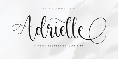 Adrielle is a Stylist & Lovely Handwritting Font. Adrielle is perfect for product packaging, branding project, megazine, social media, wedding, or just used to express words above the background. Adrielle also multilingual support. Uppercase & Lowercase font Stylistic Alternates Ligatures Symbols & Punctuation OpenType Features. Enjoy the font, feel free to comment or feedback, send me PM or email. Thank you!
 - Arnel by Craft Supply Co,
$20.00 Arnel Vintage Font is a striking sans-serif typeface that effortlessly embodies the rustic charm of vintage stamps, capturing a raw and hand-drawn aesthetic. This font is tailor-made for all your vintage display needs, exuding an authentic and weathered appearance that harks back to yesteryears. With Arnel, you can effortlessly transport your audience to an era of nostalgia and authenticity. Its rough edges and irregularities in letterforms evoke the tactile feel of aged ink stamps, giving your designs a genuine vintage appeal. Whether you’re creating posters, labels, or any project that calls for a touch of vintage character, Arnel Vintage Font adds a unique and nostalgic flair. It’s like unearthing a hidden treasure in the world of typography, making it the perfect choice for projects that aim to evoke a bygone era’s timeless charm and authenticity.
 - Ariel Conditios by Warisand,
$17.00 Ariel Conditios is a Vintage Font inspired by beautiful vintage sign art and lettering. The font comes with unique alternate design characters to give your designs an elegant and artistic look. It is perfect for logo and packaging design, short phrases or headlines.
 - Salmiak Bold Rounded - 100% free

- Klang MT by Monotype,
$29.99Will Carter, well known in connection with his private press in Cambridge, has combined the skills of a calligrapher with a practical knowledge of printing. His mastery of pen-drawn letterforms was put to practical use in the design of Klang. Klang is a slightly inclined and calligraphically shaped sans serif with short ascenders and descenders. The Klang font is useful for informal applications, such as invitations, greetings cards and posters, but can also be used in advertising. - Levenim MT by Monotype,
$50.99 - Kino MT by Monotype,
$29.99Kino font was designed in 1930 by Martin Dovey for the Monotype Corporation. Heavy in weight with the letters clipped at the top and bottom, Kino is unique among display types. Display typefaces with triangular serifs are sometimes called Latins and Kino is referred to as a serifless Latin. Use Kino font sparingly in informal display situations." - Bembo MT by Monotype,
$45.99 The origins of Bembo go back to one of the most famous printers of the Italian Renaissance, Aldus Manutius. In 1496, he used a new roman typeface to print the book de Aetna, a travelogue by the popular writer Pietro Bembo. This type was designed by Francesco Griffo, a prolific punchcutter who was one of the first to depart from the heavier pen-drawn look of humanist calligraphy to develop the more stylized look we associate with roman types today. In 1929, Stanley Morison and the design staff at the Monotype Corporation used Griffo's roman as the model for a revival type design named Bembo. They made a number of changes to the fifteenth-century letters to make the font more adaptable to machine composition. The italic is based on letters cut by the Renaissance scribe Giovanni Tagliente. Because of their quiet presence and graceful stability, the lighter weights of Bembo are popular for book typography. The heavier weights impart a look of conservative dependability to advertising and packaging projects. With 31 weights, including small caps, Old style figures, expert characters, and an alternate cap R, Bembo makes an excellent all-purpose font family.
 - Ehrhardt MT by Monotype,
$29.99 The Ehrhardt name indicates that this typeface is derived from the roman and italic typefaces of stout Dutch character that the Ehrhardt foundry in Leipzig showed in a late-seventeenth-century specimen book. The designer is unknown, although some historians believe it was the Hungarian Nicholas Kis. Monotype recut the typeface for modern publishers in 1937 to 1938. Ehrhardt has a clean regularity and smooth finish that promote readability, as well as a slight degree of condensation, especially in the italic, that conserves space. Ehrhardt is a fine text face, especially for books.
 - Falstaff MT by Monotype,
$29.99 Falstaff first appeared with Monotype in 1931, an alphabet in the style of a wide, bold antiqua that was especially popular in the first third of the 19th century. Such typefaces distinguished themselves through their consistent basis in the transitional antiqua style. They are characterized by their extremely fine unflexed serifs with no curve connecting them to the thick strokes. The numerals with their generous curves and ball-like stroke endings and beginnings are particularly decorative. The vertical strokes are dominant and give lines of this typeface a column-like and therefore static look. Falstaff is today often used for book titling, especially for mystery novels. It is best used sparingly in middle and larger point sizes.
 - MT Zephyr by Monotype,
$29.99 - Strayhorn MT by Monotype,
$29.99 Strayhorn is a sans serif development of the popular typeface family, Ellington. Although classified as a sans serif, the Strayhorn font family has markedly flared stems and calligraphic terminal treatment. A fairly condensed face with vigorous letter shapes, Strayhorn makes an eye-catching display face and an economical, legible text type. The contrast between thick and thin strokes is more apparent than in most sans serif designs, resulting in an open, rather striking appearance on the page. Strayhorn is ideal for use in advertising, flyers, labels and packaging. It will also make a refreshing alternative to the more monotone sans serifs used in magazines, periodicals, newsletters etc.
 - Castellar MT by Monotype,
$29.99 Castellar is a capital letter typeface from John Peters, named after a location in the Alps. It first appeared in 1957 with Monotype. Peters modelled the design on the Roman script Scriptura Quadrata as it was used in the first two centuries of the Roman Empire. One distinguishing characteristic is the quadratic proportions of many letters, which are however mixed with circular and narrow forms. The original script was called Scriptura Quadrata because the ancient engravers used rectangular stone plates for their work. Castellar is a typical title typeface and is best used in large and very large point sizes to highlight its classic elegance.
 - Bell MT by Monotype,
$39.00 Monotype’s hot metal Bell series from 1931 was based on original types made by the punchcutter Richard Austin for the foundry of John Bell in the 1780s. The different sizes of Monotype’s series were not all based on the same model. As type historian James Mosley wrote on Typophile, “For 18 point and above (the metal type was cut in sizes up to 36 point) Monotype’s model was a larger type [than the model used for the text sizes], the ‘Great Primer’ cut by Austin. This has greater contrast in the capitals and a flat foot to letter a.” The digital Bell closely follows the design of the hot metal 18pt version, and is therefore somewhat lighter in color than the text sizes of Monotype’s original metal face. James Mosley’s Typophile article can be found here.
 - Compacta MT by Monotype,
$29.00 Compacta is the work of Fred Lambert and is reminiscent of the extremely narrow, sans serif stencilled fonts of the 1920s, then intended as titles or headlines for magazines and posters. The characters of all cuts are narrow and the space between letters is very small. The white spaces between strokes are perceived almost as only small white stripes and dots which stand out from the black bands of the lines of text. Compacta is not meant for longer texts but is impressive in titles and headlines.
 - Coronet MT by Monotype,
$29.99
- Hashira Mt by MotionTail,
$20.00 Give your designs an authentic handcrafted feel. "Hashira Mt" is perfectly suited to signature, stationery, logo, typography quotes, magazine or book cover, website header, clothing, branding, packaging design and more. Files included: - uppercase letters - multilingual symbols - numerals - punctuation
 - Ellington MT by Monotype,
$29.99 Ellington was designed by jazz lover, Michael Harvey for Monotype in 1990, and named after the great band leader, Duke Ellington. From experience gained carving letters in stone and drawing them for book jacket designs, Michael Harvey has created a condensed typeface combining the clear-cut sparkle of a modern face with some of the lively features of the broad-edged pen. Ellington has a fresh elegance that is particularly effective in display, while its compressed forms will prove economical in text settings. The Ellington font family has narrow characters with strong vertical strokes and angular calligraphic traits. Ellington is a lively face and an appropriate font choice for advertising and book work. Ellington has a sans serif companion family, Strayhorn.
 - MT Crisiant by MysticalType,
$10.00 MT Crisiant is a new, minimalistic, elegant, and professional font. This font is suitable for making, titles, taglines, logos, and products to be printed. MT Crisiant is a sans serif typeface that is a blend of geometric and humanist. Make it more interesting and dynamic. MT Crisiant is designed for display and body text. Maximizes thickness while maintaining balance in each shape. This makes it perfect for all kinds of creative projects. The MT Crisiant comes with 18 weights and tilts to match.
 - round - Personal use only

- ROUND - Unknown license

- Round by OtterType,
$20.00 Round is an elegant and clean modern display font. You can use it for a variety of design projects like posters, business cards, wedding invitations, games, covers, social media posts, quote photos, branding, editorials, and much more. Round is a multilingual font, also supporting Cyrillic alphabet.
 - Hebrew Ariel Std by Samtype,
$59.00 This is a beautiful, modern, and super readable font. You can use it in any kind of text, from folders to prayer books. This font also has modern punctuation: shevana, kamats katan, dagesh hazak, and holam chaser.
 - Hebrew Ariel Tanach by Samtype,
$189.00 This is a modern, wonderful, and beautiful font. This font is super readable and can be used from Posters to a Hebrew Bible. The readability of this font is amazing. This font has the modern Hebrew punctuation: Shevana, Kamatz Katan, Dagesh Hazak, and Cholam Chaser.
 - Arialic Hollow - Personal use only

- Arial Nova by Monotype,
$45.99The Arial® Nova family takes Arial back to its roots. Character spacing has been adjusted and a number of subtle modifications were made to the design to return the shapes and proportions to those of the original 1982 design created for IBM's then new high-speed laser printers. Although these first Arial fonts, called "Sonora Sans" by IBM, were low-resolution bitmaps, it was apparent that the design could also be an important high-resolution digital typeface, and Arial was redrawn for Monotype's imagesetters in the late 1980s. In the process Arial evolved from its original design loosing some of its earlier personality. The restored Arial Nova family is made up of three weights of roman design of standard proportions and three weights of condensed - all with complementary italic designs. The Arial Nova family is also compatible with the fonts that Microsoft® provides in the Windows® 10 operating system. - Arial Unicode by Monotype,
$208.99Arial was designed for Monotype in 1982 by Robin Nicholas and Patricia Saunders. A contemporary sans serif design, Arial contains more humanist characteristics than many of its predecessors and as such is more in tune with the mood of the last decades of the twentieth century. The overall treatment of curves is softer and fuller than in most industrial style sans serif faces. Terminal strokes are cut on the diagonal which helps to give the face a less mechanical appearance. Arial is an extremely versatile family of typefaces which can be used with equal success for text setting in reports, presentations, magazines etc, and for display use in newspapers, advertising and promotions. - Arial Paneuropean by Monotype,
$92.99Arial was designed for Monotype in 1982 by Robin Nicholas and Patricia Saunders. A contemporary sans serif design, Arial contains more humanist characteristics than many of its predecessors and as such is more in tune with the mood of the last decades of the twentieth century. The overall treatment of curves is softer and fuller than in most industrial style sans serif faces. Terminal strokes are cut on the diagonal which helps to give the face a less mechanical appearance. Arial is an extremely versatile family of typefaces which can be used with equal success for text setting in reports, presentations, magazines etc, and for display use in newspapers, advertising and promotions. - Arial Arabic by Monotype,
$172.99 - Slab Four Rounded Bold by Wooden Type Fonts,
$15.00 An original slab serif design inspired by the slab serif designs of the 19th century, with a modern geometric look, bold version.
 - Letter Gothic MT by Monotype,
$29.99Letter Gothic font was designed by Roger Roberson for IBM sometime between 1956 and 1962. Inspired by Optima, the typeface originally had flared stems. A monospaced sans serif font designed for use on an IBM Selectric typewriter, Letter Gothic font is a good choice for tabular material. - Monotype Script MT by Monotype,
$29.99 - Monotype Modern MT by Monotype,
$29.99 Monotype Modern, the first typeface produced by Lanston Monotype, was released in 1896, the same year the company introduced its hot metal typeseting machine. It is a Victorian variation on the vertically stressed, high-contrast Bodoni model.
 - Goudy Ornate MT by Monotype,
$29.99Over the course of 50 years, the charismatic and enterprising Frederic W. Goudy designed more than 100 typefaces; he was the American master of type design in the first half of the twentieth century. Goudy Old Style, designed for American Type Founders in 1915-1916, is the best known of his designs, and forms the basis for a large family of variants. Goudy said he was initially inspired by the cap lettering on a Renaissance painting, but most of the flavor of this design reflects Goudy's own individualistic style. Recognizable Goudy-isms include the upward pointing ear of the g, the diamond-shaped dots over the i and j, and the roundish upward swelling of the horizontal strokes at the base of the E and L. The italic was completed by Goudy in 1918, and is notable for its minimal slope. Goudy Bold (1916-1919) and Goudy Extra Bold (1927) were drawn not by Goudy, but by Morris Fuller Benton, who was ATF's skillful in-house designer. Goudy Catalogue was drawn by Benton in 1919-1921 and was meant to be a medium weight of Goudy Old Style. Goudy Heavyface was designed by Goudy for Monotype in 1925, and was intended to be a rival to the successful Cooper Black. Goudy Modern was designed by Goudy in 1918; its small x-height, tall ascenders and shorter caps impart a spacious and elegant feeling. Benton designed Goudy Handtooled, the shaded version that has just a hairline of white through its bold strokes. The Goudy faces, especially the bolder weights, have long been popular for display and advertising design. They continue to pop up all over the world, and still look reassuring to our modern eyes." - Dorchester Script MT by Monotype,
$29.99Dorchester Script font, released in 1939 by Monotype, was widely accepted by high society for calling cards, announcements, and invitations. Dorchester Script is nearly upright with lowercase letters that have loops and generous ascenders and descenders and capitals with delicate, curly flourishes. Besides the usual job work, such as letterhead and business cards, Dorchester Script font can be used sparingly for serious display work. - New Berolina MT by Monotype,
$29.99 Martin Wilke designed the dynamic calligraphic typeface New Berolina in 1965. The light line of the strokes and the strong stroke contrast lets New Berolina dance across the page. Broad, generous capitals complement beautifully the narrower lower case characters with their low x-height. The capitals can also be used as initials. Used carefully and with generous line spacing, New Berolina will lend any text a fresh, lively look.
 - Gill Sans MT by Monotype,
$45.99 Gill Sans is a humanistic sans serif family that, while is considered by many to be quintessentially British in tone and concept, has been used in virtually every country and in nearly every application imaginable. Gill Sans has reached this level of near-ubiquity for one simple—and very good—reason: it is an exceptionally distinctive design with a potential range of use that is almost limitless. This toolkit family includes a wide range of styles including the standards such as Light—which is open and elegant—and a Regular that, with its flat-bottomed d, flat-topped p and q and triangular-topped t, has a more compact and muscular appearance. Its Bold styles tend to echo the softer, more open style of the light while the extra bold and ultra bold have their own vivid personalities, but each of them would make for an eye-catching headline. Take into account the family’s many weights, including condensed and extra condensed designs, and extended language support and you have yourself a tool you’ll be thrilled to return to, time and again. Gill Sans was designed by Eric Gill: a versatile, brilliant, and prolifically successful designer of the early part of the last century. One of the main reasons for the enduring success of his namesake design is that it is based on Roman character shapes and proportions, making it unlike virtually any other sans serif out there. Gill also worked his own warmth and humanity into his design, resulting in a typeface in which each weight retains a distinct personality of its own. Pair with serif fonts like Gill's own Joanna; or more modern offerings like Frutiger® Serif, Malabar™, Syntax® Serif, FF Scala®, or DIN Next™ Slab.


Page 1 of 250Next page