30 search results
(0.015 seconds)
- Argenta by Ingrimayne Type,
$9.95 Argenta is an informal, "hand-printing" font that has the appearance of writing by a child in elementary school. Argenta comes in three weights and has an oblique style for each weight. The child handwriting characteristic is developed in the ArgentaBobbed fonts, which add dots or little balls to the ends of letters. (Could they be called, "Ball Serif?")
 - Argenta by Sudtipos,
$59.00 Argenta is handwritten and fresh. The casual spirit of this face is evident, but complemented by very specific typographic details. A playful script with an immensely useful array of alternate characters. Released in OpenType format to expand possibilities of use with lots of alternates when used with OpenType-aware applications such as AdobeCS.
 - Argentum - Unknown license

- ArgentaBobbed by Ingrimayne Type,
$5.00ArgentaBobbed is an informal, "hand-printing" font with little balls that some people, often children, like to add to the ends of strokes. Maybe it could be called a ball-serif or dot-serif font. The family has six members. Each of the two weights, plain and bold, have oblique styles. There are also two variants: ArgentaBobbed-Wig is squiggly handwriting with the dots, and ArgentaBobbed-Squish is condensed handwriting with dots. - Argentile by Scrowleyfonts,
$14.00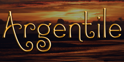 Argentile is a stylish, swirling, magical font with an organic, fairytale feel. Argentile is ideal for any project involving elves, goblins, wizards or suchlike. It includes contextual alternates for characters with swash elements or extravagant ascenders and descenders to avoid overlap.
 - Argenthus by Maulana Creative,
$14.00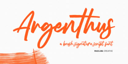 Argenthus is a fancy handwritten script font. With bold rough stroke, fun character with a bit of ligatures and alternates. To give you an extra creative work. Argenthus font support multilingual more than 100+ language. This font is good for logo design, Social media, Movie Titles, Books Titles, a short text even a long text letter and good for your secondary text font with sans or serif. Make a stunning work with Argenthus font. Cheers, Maulana Creative
 - Margenta by Sronstudio,
$15.00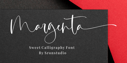 Margenta is a beautiful calligraphy font perfect for crafting, branding, invitation, stationery, wedding designs, social media posts, advertisements, product packaging, product designs, label, photography, watermark, special events or anything. Margenta comes with full set of uppercase and lowercase letters, swash alternates, ligatures,multilingual symbols, numerals and punctuation.
 - Argento by Librito.de,
$10.00 The design for this typeface is based upon four sheets of an old latin book I purchased in Hanover (Germany) a couple of years ago. The letters preserve the rough edges of the original printing, I just added a few missing letters and some ligatures.
 - Argent by Device,
$39.00 An elegant sans with a low lower-case x-height, diamond-shaped dots and a reweighed complimentary italic with subtle calligraphic touches. With its generous spacing and leading, Argent is very readable in extended text settings, appearing warm and open. The wide range of weights, from thin to heavy, provide all the necessary options for headline and text, the basis of any comprehensive design system. Perfect for brochures and magazines.
 - HV Argentine by Harmonais Visual,
$15.00 l’Argentine - a display sans with beautiful contrast & a hint of nostalgia. Specially designed for vintage, retro, elegant projects, l’Argentine is perfectly suitable for creating simple, lifestyle designs such as logos, title, packaging, and more.
 - Argent CF by Connary Fagen,
$35.00 Argent is dashing and expressive, with a pronounced x-height and evocative, flowing letterforms. Featuring charming italics, a special superbold weight, and wide language support, Argent excels in display settings like headlines, titles, and logos. As an expressive and detailed typeface, Argent pairs nicely with clean typefaces that provide contrast, such as a sans serif like Greycliff CF, Artifex Hand CF, and Articulat CF. All typefaces from Connary Fagen include free updates, including new features, and free technical support.
 - Arventa Slab Pro by preussTYPE,
$59.00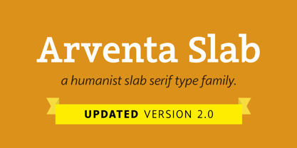
- Arventa Sans Pro by preussTYPE,
$59.00 Arventa was designed to be highly legible and flexible. Arventa offers a high quality alternative to contemporary humanist sans serifs and is a flexible family for editorials and corporate branding. Arventa comes in seven weights (ExtraLight, Light, Regular, Medium, Bold, Black and UltraBlack). I wanted to create a very refined family that could be used for display or body copy, for print or digital.
 - Correntino Railway by Fabio Ares,
$- Correntino Railway is a product of argentine typographic archeology project called “Tipografía Histórica Ferroviaria” (Fabio Ares & Octavio Osores, since 2012). Is about the signboards of the stations of the line of the Argentine Correntino Economic Railway (1892-1969). The letter of this signboards can be described as display type, with elementary geometric shapes, vertical line modulation and slight contrast.
 - Northeast Railway by Fabio Ares,
$9.99 Northeast Railway is a product of argentine typographic archeology project called "Tipografía Histórica Ferroviaria" (Fabio Ares & Octavio Osores, since 2012). Is about the signboards of the stations of the line of the Argentine North Eastern Railway Company Limited (1987-1948). The letter of this signboards can be described as display type, with elementary geometric shapes and without line modulation. The principal font of the resultant family is the bold. The family is completed with complementary fonts of different styles. The proceeds from the sale of the fonts will be used to finance the project.
 - Antagometrica BT by Bitstream,
$50.99 Antagométrica BT is the creation of Argentine designer Maximiliano Giungi. A clean and slightly condensed sanserif, it is ideal for use in text settings, but its trendy design makes it distinctive enough for display work. The CFF OpenType glyph repertoire includes additional ligatures, full sets of superior and inferior figures as well as unlimited fractions. There are also tabular and proportional figure sets, and the extended glyph set supports Central Europe.
 - Aduana by Fabio Ares,
$- Aduana is the first typographic product of argentine-chilean typographic archeology project called "Valpo. Ciudad de Letras" (Fabio Ares & Karin Thiers, since 2016). Based on the letter located on the front of the Customs building (Valparaíso, Chile). The resultant family can be described as display type and modern renaissance style, with geometric shapes and serif and mild line modulation. The proceeds from the sale of the fonts will be used to finance the project.
 - Malambo by Sudtipos,
$59.00 The master of the dancing brush, Angel Koziupa, and the node-obsessed perfectionist, Alejandro Paul, offer up another bucket of fun with Malambo. This time Koziupa allows his brush to jitter one whole millimeter, and Paul digitizes with two eyes instead of his usual three. Follow your heart, but consume an ounce of peroxide first. Full of energy and cheeky mischief, Malambo tells the eye amusing stories of mirrorless shaving accidents, wine mistakenly poured over the morning cereal, and someone who trips over his own shadow on the dance floor, yet keeps on dancing. And dancing is what this typeface is all about. Malambo is a traditional Argentine dance performed by the gauchos (the Argentine equivalent of 19th century North American cowboys?). The gauchos are still around in the less than touristic areas of Argentina. And although they dance quite passionately and make the heartiest parrillas, most of them probably don't know what a font is. But you know, and we know. And that's something. Malambo was selected as the Best in show display font at the Biennial Letras Latinas.
 - Delator by FedeBiagioli TypeFoundry,
$30.00 Delator font is a display typeface, inverted contrast, and condensed. Inspired by the personal experience of the designer who, with resilience and daily struggle, managed to get ahead. Its name is linked to the song of an Argentine rock artist called "Corazón delator", this means that it is a typeface that does not go unnoticed, it attracts attention for its shapes and its way of being and above all, when it is present, it automatically "gives itself away".
 - Matogrosso Script by Sudtipos,
$59.00 Matogrosso is another rough script from Argentine calligraphy team Koziupa and Paul. With its expressive urge at the importance of discovery, it is ideal to use on wine labels or organic food packaging, stationery and old maps. It also makes a great choice for designs relating to outdoor activities and rugged travel, where the concept of the wild is to be accentuated. Matogrosso's OpenType programming combines several alternate lowercase characters to generate perfectly fit and more natural textures.
 - Promethium by Mysterylab,
$17.00 Promethium is an elegant vintage-style condensed font with lots of ornate detailing. Ideal for western, cowboy and rodeo graphics, as well as circus & carnival themes. Additionally, Promethium can trace some of its design roots to the well established Argentine graphic style known as Fileteado, as well as to Victorian poster and book arts. The stacking & layering of the 4 different versions of the font can yield a great range of eye-catching diverse looks and color schemes that can fit many purposes.
 - Tanguera by Sudtipos,
$59.00 While Bellas Artes, Koziupa and Paul's "other" look at intertwined classicism in calligraphy, can be compared to the repeated patterns of standardized dance steps, Tanguera is more like dancers engaged in a free form of the classic Argentine dance. Whether the embrace is open or closed, the walk parallel or crossed, it is still classical tango, with leader and follower blending together, sometimes in relaxed softness, sometimes in alert sharpness, yet never losing the clearest of communication. Tanguera provides essential rhythm to any packaging design that calls for clean and classical personalization.
 - Cenizas by Sudtipos,
$79.00 Cenizas is another masterpiece of rough-and-tumble script from the prolific Argentine duo of Koziupa and Paul. Although the overall 'wildness' of Cenizas is reminiscent of popular mid-twentieth-century English display scripts, Koziupa's Latin brush humor and ingenuity remain evident in the underlying structure of the design. Casual, care-free and adventurous, Cenizas can be a great choice for design applications relating to active behavior, like outdoor sports and travel. It also is enough of a rough script to be quite useful in a variety of other design contexts, such as the covers of art books or historical novels, museum literature, music sleeves and posters, or even map designs.
 - Bakery Script by Sudtipos,
$49.00 Bakery Script is the Argentine duo's nod to the high spirits of the 1970s. Angel Koziupa used his ever popular wild brush to draw the outline version, and Alejandro Paul refined it, expanded it, then extrapolated the solid version. While the outline version makes the letters seem like they're growing out of each other's shadows, the solid version presents a wilder version of the casual dancing letters Koziupa's brush has entertained us with during recent years. Sharp in places, perfectly curved in others, and with many letter alternates and ligatures included within the fonts, Bakery Script would be at home in packaging design, outdoors and adventure literature, and everywhere a display design needs that sharp but friendly touch to reach its goal.
 - Festival Script Pro by Sudtipos,
$69.00 Festival Script is a logical evolution within the deco script territory previously explored by Koziupa and Paul in efforts like Aranjuez, Bellas Artes, Heraldica and Tanguera. In Festival Script, strong bilinear contrast and ornamental swashes combine to convey a sense of modern luxury. This combination echoes the current trend in consumer goods of elevating simple, everyday products to objects of desire. Festival’s basic structure is the familiar Koziupa aesthetic of tapering stems and sharp endings, but this time informed by a more geometric sensibility. A wide variety of thin, ribbonlike strokes add a beautifully ornamental feel, evoking Argentine “filete” motifs. Almost every letterform includes multiple alternates, providing design possibilities from minimal to exuberant. Festival Script Pro is loaded with alternates, swashes, endings and Latin-based language support.
 - Provincial Railway by Fabio Ares,
$19.99 Provincial Railway is the first product of argentine typographic archeology project called "Tipografía Histórica Ferroviaria" (Fabio Ares & Octavio Osores, since 2012). Is about the signboards of the stations of the P1 line of the Provincial Railway of Buenos Aires (1907-1977). The letter of this signboards can be described as display type, with a tall box and a constructivist style, with elementary geometric shapes and without line modulation. Although without a doubt, its differential feature is provided by the rectangular shapes that it has towards the ascending and descending lines, which in some cases coincide with the stems, showing a curious rhythm in the composition of the text line. The family is completed with complementary fonts of different styles. The proceeds from the sale of the fonts will be used to finance the project.
 - Envelove by Sudtipos,
$39.00 «Envelove» is the brand new typographic challenge handwritten by Yani Arabena and designed along with Guille Vizzari and Ale Paul, for Sudtipos. It all started as a game for Yani. A carefree and spontaneous calligraphy, making use of the pointed nib with black ink, exploring its expressive possibilities pressing against paper. With time that nib turned into her dearest tool to flow through her writing, breeding this particular style of hers that let her trespass the barrier that kept personal and professional passions apart. All that inspiration is present in «Envelove», a play on words that reflects the love of letters. An expressive free-and-easy typeface that follows no formal calligraphic model and lets itself go with the meaning of words, rhythm and sensations. «Envelove» successfully joins three different fonts, «Envelove Script»—free, spontaneous and unique of its kind—going together with «Envelove Caps»—an uppercase style that builds controlled but dynamic words thanks to its alternates and ligatures, and to its own true Small Caps set as well—and «Envelove Icons», ideal to decorate and bring to life any written message. «Envelove» encourages you to write as if you have a nib, ink and an envelope. It invites you to take part in other worlds like a magic cocktail, a summer night, a long-awaited reunion, a first dance, a dish cooked with your own hands. The fashion world, gourmet, stationery, scrapbooking and everyone where a Handmade or Handcrafted feel is craved for, save a special place for «Envelove». (The illustration series that are shown with «Envelove» were made by the incredible Argentine illustrator Eugenia Mello.)
 - Cinema Macabre by Wing's Art Studio,
$10.00 Cinema Macabre: Horror Fonts Torn from the Pages of Giallo A Hand-drawn Display Font for Creating the Most Diabolical Horror Titles This loose and inky brush font takes its inspiration from the classic Giallo film posters of the 1960s to 1980s - a cult cinematic subgenre beloved for its stylish visuals, haunting soundtracks and exploitation led marketing. It's a devilishly drawn design that aims to capture the feeling of vintage horror, preserving analogue details of old print while remaining versatile enough to work across a variety of digital designs. The Cinema Macabre font family boasts six fonts, each containing a unique set of uppercase and lowercase characters, as well as numerals, punctuation and language support. Add to this a host of custom ligatures, underlines and graphic elements and you have an essential toolbox for creating truly hand-made looking title designs. Cinema Macabre if a font that rewards experimentation by mixing all the various upper and lowercase alternatives, with interesting combinations waiting to be found and inspire terror across your own movie posters, book covers, albums and editorials. Few other fonts offer the versatility to create such diabolical designs! A Brief Introduction to Giallo: In popular cinema, Giallo is a genre of mystery fiction and thrillers often containing slasher, psychological horror, exploitation, supernatural and erotic elements. The term giallo (meaning yellow) derives from a series of pulp novels published by Mondadori from 1929 taking the name from its trademark yellow covers. The series consisted of Italian translations of mystery novels by well-known authors such as Agatha Christie, Edgar Allan Poe and Raymond Chandler. The popularity of these cheap paperbacks eventually established the word Giallo as a synonym in Italian for a mystery novel. The cinematic Giallo subgenre developed during the 1960-80s and are noted for their vivid cinematography, memorable soundtracks and inventive gore-filled scenarios. Key examples include Dario Argento's Suspiria, Tenebrae and Deep Red - stylish films that at once influenced the American slasher (see Black Christmas and Friday 13th) up to todays horror in Censor and Last Night In Soho.
 - The CHE LIVES! font, designed by Levi Halmos, is a striking and evocative typeface that captures the spirit of rebellion and revolutionary zeal. This font is an artistic homage to the iconic Argentin...
- Affair by Sudtipos,
$99.00 Type designers are crazy people. Not crazy in the sense that they think we are Napoleon, but in the sense that the sky can be falling, wars tearing the world apart, disasters splitting the very ground we walk on, plagues circling continents to pick victims randomly, yet we will still perform our ever optimistic task of making some little spot of the world more appealing to the human eye. We ought to be proud of ourselves, I believe. Optimism is hard to come by these days. Regardless of our own personal reasons for doing what we do, the very thing we do is in itself an act of optimism and belief in the inherent beauty that exists within humanity. As recently as ten years ago, I wouldn't have been able to choose the amazing obscure profession I now have, wouldn't have been able to be humbled by the history that falls into my hands and slides in front of my eyes every day, wouldn't have been able to live and work across previously impenetrable cultural lines as I do now, and wouldn't have been able to raise my glass of Malbeck wine to toast every type designer who was before me, is with me, and will be after me. As recently as ten years ago, I wouldn't have been able to mean these words as I wrote them: It’s a small world. Yes, it is a small world, and a wonderfully complex one too. With so much information drowning our senses by the minute, it has become difficult to find clear meaning in almost anything. Something throughout the day is bound to make us feel even smaller in this small world. Most of us find comfort in a routine. Some of us find extended families. But in the end we are all Eleanor Rigbys, lonely on the inside and waiting for a miracle to come. If a miracle can make the world small, another one can perhaps give us meaning. And sometimes a miracle happens for a split second, then gets buried until a crazy type designer finds it. I was on my honeymoon in New York City when I first stumbled upon the letters that eventually started this Affair. A simple, content tourist walking down the streets formerly unknown to me except through pop music and film references. Browsing the shops of the city that made Bob Dylan, Lou Reed, and a thousand other artists. Trying to chase away the tourist mentality, wondering what it would be like to actually live in the city of a billion tiny lights. Tourists don't go to libraries in foreign cities. So I walked into one. Two hours later I wasn't in New York anymore. I wasn't anywhere substantial. I was the crazy type designer at the apex of insanity. La La Land, alphabet heaven, curves and twirls and loops and swashes, ribbons and bows and naked letters. I'm probably not the very first person on this planet to be seduced into starting an Affair while on his honeymoon, but it is something to tease my better half about once in a while. To this day I can't decide if I actually found the worn book, or if the book itself called for me. Its spine was nothing special, sitting on a shelf, tightly flanked by similar spines on either side. Yet it was the only one I picked off that shelf. And I looked at only one page in it before walking to the photocopier and cheating it with an Argentine coin, since I didn't have the American quarter it wanted. That was the beginning. I am now writing this after the Affair is over. And it was an Affair to remember, to pull a phrase. Right now, long after I have drawn and digitized and tested this alphabet, and long after I saw what some of this generation’s type designers saw in it, I have the luxury to speculate on what Affair really is, what made me begin and finish it, what cultural expressions it has, and so on. But in all honesty it wasn't like that. Much like in my Ministry Script experience, I was a driven man, a lover walking the ledge, an infatuated student following the instructions of his teacher while seeing her as a perfect angel. I am not exaggerating when I say that the letters themselves told me how to extend them. I was exploited by an alphabet, and it felt great. Unlike my experience with Ministry Script, where the objective was to push the technology to its limits, this Affair felt like the most natural and casual sequence of processions in the world – my hand following the grid, the grid following what my hand had already done – a circle of creation contained in one square computer cell, then doing it all over again. By contrast, it was the lousiest feeling in the world when I finally reached the conclusion that the Affair was done. What would I do now? Would any commitment I make from now on constitute a betrayal of these past precious months? I'm largely over all that now, of course. I like to think I'm a better man now because of the experience. Affair is an enormous, intricately calligraphic OpenType font based on a 9x9 photocopy of a page from a 1950s lettering book. In any calligraphic font, the global parameters for developing the characters are usually quite volatile and hard to pin down, but in this case it was particularly difficult because the photocopy was too gray and the letters were of different sizes, very intertwined and scan-impossible. So finishing the first few characters in order to establish the global rhythm was quite a long process, after which the work became a unique soothing, numbing routine by which I will always remember this Affair. The result of all the work, at least to the eyes of this crazy designer, is 1950s American lettering with a very Argentine wrapper. My Affair is infused with the spirit of filete, dulce de leche, yerba mate, and Carlos Gardel. Upon finishing the font I was fortunate enough that a few of my colleagues, great type designers and probably much saner than I am, agreed to show me how they envision my Affair in action. The beauty they showed me makes me feel small and yearn for the world to be even smaller now – at least small enough so that my international colleagues and I can meet and exchange stories over a good parrilla. These people, whose kindness is very deserving of my gratitude, and whose beautiful art is very deserving of your appreciation, are in no particular order: Corey Holms, Mariano Lopez Hiriart, Xavier Dupré, Alejandro Ros, Rebecca Alaccari, Laura Meseguer, Neil Summerour, Eduardo Manso, and the Doma group. You can see how they envisioned using Affair in the section of this booklet entitled A Foreign Affair. The rest of this booklet contains all the obligatory technical details that should come with a font this massive. I hope this Affair can bring you as much peace and satisfaction as it brought me, and I hope it can help your imagination soar like mine did when I was doing my duty for beauty.
