43 search results
(0.006 seconds)
- Acton by Device,
$29.00 Acton is a deceptively simple, grid-based design. Though derived from a 2 by 3 arrangement of blocks, it uses white spaces to allow for more complex shapes – for example as the R – where the underlying 3 by 5 arrangement is apparent. It also departs from this strict grid-based logic for characters such as the the T, L, f and r, whose cross-bars are shorter than they would otherwise be in order to promote optical evenness. No elegant solution could be found for the V, which in geometric fonts can appear very similar to the U, lacking as it does the cross-bar that can differentiate a square A from the capital form of the n. However, the resultant diagonal retroactively proved useful on the lower-case e and a, characters that otherwise would have more uninteresting design solutions.
 - Aston by Fontfabric,
$40.00 Aston is a custom sans serif font which is applicable for any type of graphic design - web, logo, print, motion graphics, and more.
 - Artonic by Seventh Imperium,
$37.00 Artonic is a tattoo script typeface inspired by elegant script and sharp look typeface. The characteristic of artonic is flowing edge, elegant,sharp and black. These typefaces are made out of pride and passion for urban tattoo design. Of course Artonic comes with a variety of ligatures and alternative forms, available through OpenType features.
 - Altone by Eko Bimantara,
$29.00 Altone was created in a pursue of regularity and conventional geometric sans serif typeface which tend to be easy to receive by it's reader, broad usage possibility, shown a simple, bold and strong personality. The letterforms are more likely associated with Grotesk rather than the original classical Bauhaus style, formed in moderate and proportional width, flat apex, closed aperture with straight cuts stroke ends. Consist of 9 weight from Thin to Heavy with each matching Obliques. Contain several OpenType features: Stylistic Alternates, Figures Variation (fraction, tabular lining, numerator, denominator), and also covered broad latin languages. Provided also variable fonts in two styles; Upright and Oblique
 - P22 Afton by IHOF,
$24.95 A cursive font with a curvilinear feel, named for the Scottish stream immortalized by the poet Robert Burns. Useful for menus, certificates, display lines, short paragraphs or poetry setting.
 - Atonement by Hanoded,
$15.00 Atonement is a splattery, scratchy font. I made it with a steel nibbed pen, a brush and some Chinese ink. I based it on my fonts Ravenheart, Qilin and American Grunge - mostly because I really like them. Of course, all of these fonts are influenced by the work of the great Ralph Steadman - someone I greatly admire. Atonement comes with ligatures for double letter combinations and a stash of diacritics.
 - Sweet Afton NF by Nick's Fonts,
$10.00 Samuel Welo offered the pattern for this font as a titling font for silent movies. Its rustic charm has held up well, some eighty years on. Both versions of this font support the Latin 1262, Central European 1250, Turkish 1254 and Baltic 1257 codepages.
 - Astone Blood by Just Lett,
$18.00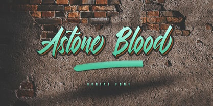 Astone Blood is a script font. It is perfect for graffiti, lettering, typography, calligraphy, posters, logotype, and more. This font is inspired by graffiti fonts on the street walls. Astone Blood has several alternate lowercase characters, and some lowercase ligature characters that make your design unique. Features: ~ UPPERCASE ~ lowercase ~ Numeral and Punctuation ~ Multilingual Support
 - Baverley Astone by Letterhend,
$19.00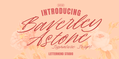 Introducing, Baverley Astone Signature Script - an authentic hand writing with natural signature style. This type of font perfectly made to be applied especially in logo, and the other various formal forms such as invitations, labels, logos, magazines, books, greeting / wedding cards, packaging, fashion, make up, stationery, novels, labels or any type of advertising purpose. Features : uppercase & lowercase numbers and punctuation multilingual alternates and ligatures swashes PUA encoded We highly recommend using a program that supports OpenType features and Glyphs panels like many of Adobe apps and Corel Draw, so you can see and access all Glyph variations.
 - Astone Nouvea by Gatype,
$12.00 Astone Nouvea is a unique and very elegant font for brand and logo designs. With this font, it will be easy for you to fulfill the wishes of customers who are often asked to design a logo with a unique style but with an elegant shape. So, we tried to brainstorm and come up with this font to get ideas out. It is perfect for BRANDING and LOGO DESIGN. You will get a classy, elegant, and of course unique logo with this font. Hope you enjoy this font!!
 - Alton JNL by Jeff Levine,
$29.00Alton JNL is an ultra-bold sanserif design that's perfect for any headline application. - Anton Charlote by Gloow Studio,
$16.00 Introducing Anton Charlote - A Display Retro Script Font. In creating this font, I just wanted to combine classic style with modern retro style, so be this font. Hope you like it. Inspired by some retro fonts that I made before. Anton Charlote is perfect for vintage and retro design, badge, logos,t-shirt, poster, branding, packaging, signage, book coverand so much more! Come with Opentype feature with a lot of alternates, its help you to make great lettering. This font is also support multi language.
 - Afons Infant by Andy Peat,
$9.00 About this font family Afons Infant has been designed for children’s storybooks; using round, single-decker letter forms to create simple, clear and readable stories that children are familiar. Features 5 weights (from thin to bold) Multi language Lowercase Numerals to blend with text Ligatures To be able to access alternative fonts, make sure the software you use can support opentype features such as Microsoft Word, Paint, Adobe, Corel draw and other applications. Designed and published by Andy Peat. Released April 2022
 - Aston Script Pro by TRF,
$25.00 Aston Script is a calligraphy script font that comes with very beautiful changing characters, a kind of classic decorative copper script with a modern touch, designed with high detail to bring stylish elegance. Aston Script is attractive as a typeface that is smooth, clean, feminine, sensual, glamorous, simple and very easy to read, because there are many fancy letter connections. I also offer a number of viable style alternatives for many letters. The classic style is perfect to be applied in various formal forms such as invitations, labels, restaurant menus, logos, fashion, make up, stationery, novels, magazines, books, greeting / wedding cards, packaging, labels or any type of advertising purpose. Aston Script has 1330+ glyphs and 1039 alternative characters, including various language support. With OpenType features with alternative styles and elegant ligatures. The OpenType feature does not work automatically, but you can access it manually and for the best results needed for your creativity in combining this Glyph variation. ? New Update, Now the Aston Script font has been updated or has two styles with the Aston Script Bold version.
 - O-Anton SB by Scangraphic Digital Type Collection,
$26.00Since the release of these fonts most typefaces in the Scangraphic Type Collection appear in two versions. One is designed specifically for headline typesetting (SH: Scangraphic Headline Types) and one specifically for text typesetting (SB Scangraphic Bodytypes). The most obvious differentiation can be found in the spacing. That of the Bodytypes is adjusted for readability. That of the Headline Types is decidedly more narrow in order to do justice to the requirements of headline typesetting. The kerning tables, as well, have been individualized for each of these type varieties. In addition to the adjustment of spacing, there are also adjustments in the design. For the Bodytypes, fine spaces were created which prevented the smear effect on acute angles in small typesizes. For a number of Bodytypes, hairlines and serifs were thickened or the whole typeface was adjusted to meet the optical requirements for setting type in small sizes. For the German lower-case diacritical marks, all Headline Types complements contain alternative integrated accents which allow the compact setting of lower-case headlines. - JustFont - Personal use only

- Psychadelic - Unknown license

- Scoto Koberger Fraktur N11 by Intellecta Design,
$9.00digitization of autentic medieval blackletters from Anton Koberger and Otavia Scotus german typographers, from incunabula books - Skipper Stencil - Personal use only

- Glagol Rock - Unknown license

- Scoto Koberger Fraktur N9 by Intellecta Design,
$9.00a free digitization of ancient types of Ottaviano Scotus, from incunabula times, printed in Germany by Anton Koberger - Benjamin Franklin - Personal use only

- Loose Caboose NF by Nick's Fonts,
$10.00Break out the love beads and fire up the lava lamp! Here’s a fresh take on the Artone alphabet, designed by Seymour Chwast in the 1960s. Beefy, bodacious and bottom-heavy, this typeface keeps on truckin' along. Both versions of this font include the complete Unicode Latin 1252 and Central European 1250 character sets. - Hounslow by Device,
$29.00 Hounslow is closely related to Acton in structure, and takes the latter’s simple block construction into the third dimension. Three variants – open, solid and shadow – can be freely mixed in one setting for effect. Originally designed solely in the italic variant, an upright was added by request. A further unreleased set with a range of line weights was later commissioned by the New York Times magazine, and used extensively in their television supplement.
 - Honeybird by Scholtz Fonts,
$21.00 Honeybird originated in a study of calligraphic fonts of the 20th century, took its own direction and developed into a slightly quirky, very readable contemporary script font, typical of Anton Scholtz's free-wheeling style. The exaggerated upper case characters create an exuberance, while the small lower case characters maintain the impression of restrained order with flashes of quirky contrast. Honeybird has 45 OpenType ligatures, designed to ensure the smooth flow of the text.
 - Janson Text by Linotype,
$29.99 The Janson font was based on the matrices made for the typeface in the 17th century. It originated from the Dutch typeface designer Anton Janson and was cut by Nicholas Kis. The strong main strokes and fine hair strokes were influenced by the art of copper engraving. In 1983, Prof. Horst Heiderhoff led the expansion of the Janson into a font family with various stroke contrasts and gave it the name Janson Text.
 - Dutch Deco JNL by Jeff Levine,
$29.00 Although the Art Deco movement is generally attributed to the 1930s and 1940s, a number of design influences were showing up during the late 1920s in what is referred to as the Art Nouveau period. The Dutch illustrator Anton Kurvers’ hand lettering on the front cover of the (1927) magazine “Het Vlaamsche Volstooneel” clearly shows the clean lines and Avant Garde geometrics that foreshadow Art Deco. This attractive pre-Deco lettering has been recreated digitally as Dutch Deco JNL, and is available in both regular and oblique versions.
 - Skaryna 2017 Title by Koval TF,
$9.98 Skaryna 2017 Title is a revival of the original typeface designed and cut by Francisk Skaryna in 1517–1519. Skaryna 2017 Title is designed to celebrate the 500th anniversary of the original work by Francisk Skaryna (lat. Franciscus Scorina de Poloczko) — scientist and educator from Polotsk (current Belarus). The original designs contain only Cyrillic characters. So Latin and additional characters were added to make the legacy of Francisk available for the World. The revival was designed to stay close to the original and remain a little bit inaccurate as early Renaissance printing technologies were. This project was sponsored by Anton Bryl.
 - Kis by ParaType,
$30.00 The Bitstream version of Linotype Janson. Nicholas Kis (Miklos Kis) was a Hungarian punchcutter who worked in Amsterdam. His types are some of the greatest in the Dutch old face style and have been used as models for a number of developments in this century. The Linotype version of this style, Janson, was created by Chauncey H.Griffith in 1937 and based on an original face cut by Kis in 1670–90. The face is named after Anton Janson, a Dutchman who worked in Leipzig, with whom the face has no connection. The typeface is used for text setting. Cyrillic version was developed at ParaType in 2001 by Vladimir Yefimov.
 - Monotype Janson by Monotype,
$29.00 The Monotype Janson font family is based on types originally cut by the Hungarian punch-cutter, Nicolas Kis circa 1690. Named after Anton Janson, a Dutch printer. The original matrices came into the hands of the Stempel foundry in Germany in 1919. New type was cast and proofs made; these were used as the source for Monotype's version of Janson. The original hand cut Janson types have a number of small design irregularities which give the typeface its unique charm. These have been carefully incorporated into the new version. The overall effect is of even color and an easy readability that makes Monotype Janson most at home in book and publishing work.
 - WriteHand by Scholtz Fonts,
$21.00 WriteHand is a light-hearted, fluid, freeform script font. It is one of Anton Scholtz's contemporary designs. Based on actual handwriting, the font contrasts a strong, artistic nature with a feminine sensitivity. WriteHand successfully combines exuberant capitals with devil-may-care swashes, and toned down lower case characters to make an extremely readable handwritten font. The font is most versatile and has a number of uses, among which are contemporary invitations, greeting cards, magazine pages, adverts, cosmetic packaging and promotions, clothing swing tags and promotions, and book covers. It has been carefully letterspaced and kerned. It contains a full character set: all upper and lower case characters, punctuation, numerals and accented characters are present.
 - Closet Skeleton by Hanoded,
$20.00 Some time ago I stumbled upon a little book called 'De Sprookjeshoorn' ('Horn of Fairy Tales') by Anton Eijkens (1920 - 2012). It was published in 1946 and contains several authentic and unique fairy tales - unfortunately unreadable to modern children, as the language used is out of date. What caught my eye was the handwritten font on the cover of the booklet. Closet Skeleton is a fairytale font inspired by the one I found on the cover of De Sprookjeshoorn. It comes with several curly alternates and some end-ligatures as well. I added an 'old fashioned' ampersand and a modern one, so you can choose which one to use. Apart from that, Closet Skeleton comes with a closet choc-a-block full of diacritics.
 - Kis Classico by Linotype,
$29.99Kis Classico™ is named after the Hungarian monk Miklós Kis who traveled to Amsterdam at the end of the seventeenth century to learn the art of printing. Amsterdam was a center of printing and punchcutting, and Kis cut his own type there in about 1685. For centuries, Kis's type was wrongly attributed to Anton Janson, a Dutch punchcutter who worked in Leipzig in the seventeenth century. Most versions of this type still go by the name Janson. In 1993, the Italian/Swedish type designer Franko Luin completed Kis Classico, his own contemporary interpretation of the Kis types. About the Kis/Janson story, Luin says: If you understand Hungarian I recommend you read the monograph, 'Tótfalusi Kis Miklós' by György Haiman, published in 1972 by Magyar Helikon. It has hundreds of reproductions from his Amsterdam period and from the time when he was an established printer in Kolozsvár (today's Cluj in Romania)." Kis Classico has five weights, and is an admirable version of this classic type. - Dufour by Scholtz Fonts,
$19.00 Dufour was named in honor of an art deco font called "Independent" designed in the 1930s by Collette and Dufour. "Dufour" is influenced by the original font, however, there are substantial differences: instead of small caps, a true lower case was created, the upper case character proportions and shapes have been greatly modified, and all missing characters have been created to make a truly modern font which nevertheless has all of the panache of the original. A related font is Collette, designed by Anton Scholtz, however, Dufour has a softer feel that is more true to the original art deco period. Dufour comes in four styles: Dufour Regular, Dufour Regular Outline, Dufour Condensed, and Dufour Condensed Outline. The font has been carefully kerned and best results are obtained if kerning is switched on. (All-caps passages work well.) It is best used to create a retro feel and in headings, subheads and in short passages of text. Very effective in marketing for products for children.
 - Scrittura by Scholtz Fonts,
$12.50 Scrittura was inspired by Anton Scholtz’s font, Honeybird, and developed into a contemporary variation with three styles. Scrittura Moderna: sleek and calligraphic. A dramatic, vigorous yet elegant font, whose upright letter shapes flow into each other like molten gold. Use Moderna for marketing cosmetics and clothing, for book covers, greeting cards, wedding stationery. Scrittura Antiqua: weathered, almost grungy. A new font with an “antique” look , reminiscent of ancient parchment manuscripts. Use Antiqua for certificates, medieval banquet or wedding stationery, theatre posters and programs, and book covers. Scrittura Fantasia: magical and ghostly. A slightly distorted, evoking Halloween, the Day of the Dead, and your favorite horror movie. Use Fantasia for horror comic covers & posters, horror movie posters, CD covers, Halloween material. The font contains over 272 characters - (upper and lower case characters, punctuation, numerals, symbols and accented characters are present). It also includes "open-type"characters to enhance the flow of the text. It has all the accented characters used in the major European languages.
 - VLNL Berlagebrug by VetteLetters,
$30.00 VLNL Berlagebrug Designer Donald DBXL Beekman daily crosses the Berlage bridge spanning the Amstel river in Amsterdam. The Berlagebrug was built as part of the city planning project ‘Plan Zuid’ by H.P.Berlage and opened in May 1932. Its name, carved out of two granite headstones, sparked the design of this font family. The original lettering is attributed to Anton Kurvers in the early 19th century, and can be seen on many Amsterdam buildings and bridges. It’s typical lettering of the Amsterdamse School, the Dutch equivalent of the expressionist art deco architectural style, and mostly known for its extravagant brick work. VLNL Berlagebrug is a rounded display font that comes in three outline styles matching the building materials used in the bridge. Gietijzer (cast iron) is smooth, Zandsteen (sandstone) has a softly distressed outline, and Graniet (granite) is outspoken rough and crumbled. The capital letters in VLNL Berlagebrug are in the Amsterdamse school style, the lowercases are more straight alternate capitals, giving you more design options.
 - Thystle by Scholtz Fonts,
$25.00 Thystle is a "font for all seasons". It has six styles ranging from fine to in-your-face, from delicate mono-weight pen strokes to fully calligraphic lines, from delicate, narrow characters to bold, powerful statements. Characteristically, all the styles abound with Anton Scholtz's energetic "creative common" style - extravagant capitals, clear characters, and bursting-with-life swashes. Three Thystle styles are calligraphic. You can use: - Regular for invitations, poems, greeting cards and body text - Black for swing tags, music media, menus and sub-headings - Fat for posters, book covers and headings Three Thystle styles are monolinear. You can use: - Mono1, which is both delicate and condensed in width, for invitations, poems, greeting cards and body text - Mono2, which is of medium weight and condensed in width, for swing tags, music media, menus and sub-headings - Mono3, which is heavier and of standard width, for posters, book covers and headings. Opentype features include alternative upper case characters, as well as a number of ligatures. (These can be used in applications that access OpenType features.) Thystle contains over 283 characters - (upper and lower case characters, punctuation, numerals, symbols and accented characters for both Text and Display caps). It has all the accented characters used in the major European languages.
 - Fnord by Monotype,
$23.99 Fnord is a contemporary humanist serif typeface, it is ideally suited for display purposes, titling, headline copy and branding. The family has been designed to be highly versatile, containing a total of 23 fonts. Each font features discretionary ligatures, swash alternates and true small caps. The overall design is clean and simple with a little bit of rebelliousness thrown in for good measure – Fnord does not conform to the traditional serif blueprint. Fnord’s design has been strongly influenced by the complex, thought-provoking and mischievous works of authors Robert Anton Wilson and Robert Shea from the 1970s. I was re-reading their work while sketching the initial letterforms and realised that some of the proportions and angles were coinciding with some themes that run through the books – particularly the numbers 5, 17, 23, 40 and 93, which are key to this font family’s spacing and geometry. I found it both very interesting and enjoyable to play with a specific theme and purpose for creating this typeface. I am sure you will enjoy working with it in your own design projects. Key features: • 5 Weights in 4 Styles – Roman, Italic, Condensed and Extended • 3 Additional Display Styles in 1 Weight – Engraved, Inline and Woodcut • Small Caps, Alternates, Swashes and Discretionary Ligatures • Full European character set • 680 glyphs per font.
 - Regave by Wahyu and Sani Co.,
$25.00 Introducing Regave, a typeface inspired by Danish style lettering based off the work of Knud Valdemar Engelhardt (1882–1931) who designed the street signs for the Copenhagen suburb of Gentofte. The Engelhardt's design was loosely based on the lettering of two Danish architects of the time: Thorvald Bindesbøll (designer of the Carlsberg logo) and Anton Rosen. The signs were so successful that they’re still in use today. The most noticeable characteristic of Danish style are: a flat apex of the A the widening of diagonal terminals a double-storey g with its loop terminating before it forms the bottom most stroke (Erik Spiekermann coined this a Danish g) a single-story g with a stumpy tail a K with an almost laterally moved crotch, connected to the stem by an extra horizontal stroke widened diagonal connecting strokes forming flat apex or baseline strokes Regave comes in 11 weights from Thin to ExtraBlack with matching italics and also available in Variable Font format for more flexibility in weight selection. This family also equipped with useful OpenType features such as Ordinals, Superscripts, Subscripts, Stylistic Alternates, Stylistic Sets, Proportional Lining, Standard Ligatures, Fractions, Numerators & Denominators. Each font has 490+ glyphs which covers Western & Eastern Europe, and other Latin based languages – over 200 languages supported! Regave will be suitable for many creative projects. This masculine, strong and unique typeface will be suitable for logos, posters, presentations, headlines, lettering, branding, quotes, titles, magazines, headings, web banners, mobile applications, art quotes, advertising, packaging design, book title, and more!
 - Chekhovskoy, designed by the talented Marat Salychow, is a font that carries a distinct aura of refinement mixed with a touch of old-world charm. At first glance, it is immediately apparent that Chek...


Page 1 of 2Next page