58 search results
(0.005 seconds)
- Raffles by Scrowleyfonts,
$20.00 Raffles is an Art Deco inspired font which takes geometric lettering to another level with comprehensive contextual alternates for exciting uppercase titling. There are four different styles available for a retro or a more contemporary look and feel. I hope that you will enjoy using it as much as I enjoyed creating it!
 - Viennese Waffles by Anastasia Kuznetsova,
$19.00 Say hello to Viennese Waffles!! :) A nice, wobbly, playful pencil font with a handwritten inscription-with a fine texture built right into it!! Great for outstanding quotes, playful branding, children's books, fancy greeting cards, cooking recipes, menu design and more! Font Features A-Z; character set a-z; 1 language (English); numbers and punctuation marks, symbols A font containing uppercase and lowercase letters, numbers, and a wide range of punctuation marks. Fonts can be opened and used in any software that can read standard fonts, even in MS Word. No special software is required, and to get started. It is recommended to use it in Adobe Illustrator or Adobe Photoshop Made with love and magic ♡ Thank you for checking it out and feel free to send me a message if you have any questions! ~ Anastasia
 - Honey Waffles by Allouse Studio,
$16.00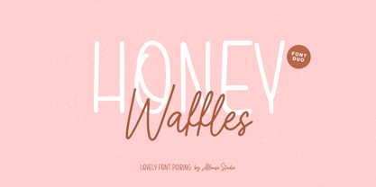 Proudly Presenting, Honey Waffles is a Lovely Font Pairing. Honey Waffles is perfect for any titles, logo, product packaging, branding project, megazine, social media, wedding, or just used to express words above the background. Honey Waffles also come with Multi-Lingual Support. Enjoy the font, feel free to comment or feedback, send me PM or email. Thank You!
 - Allergic to Waffles by PizzaDude.dk,
$15.00 Luckily, I am not allergic to waffles - but a guy named Ethan Tremblay is...and if you know the story about that guy, you know the name of this font is from! What can I say? A handmade font full of quirkiness and a rough outline. Comes in both Regular (outline) and Solid. Use both versions as they are, or combine them. I've added 4 different versions of each lowercase letter and multilingual support!
 - Gaufre de Bruxelles by TypeAddiction,
$10.80 TypeAddiction presents “Gaufre de Bruxelles”, a playful handmade uppercase font. Lowercase letters have filled letters (A, B, D, O etc) and the uppercase letters have unfilled letters. "Gaufre de Bruxelles" means a Brussels waffle in English. The Brussels waffle is a rectangular-shaped waffle and is a Belgian culinary speciality. The characters of the font were inspired by the waffle dough and more specifically the shape that the dough takes when it is poured into the waffle iron.
 - VLNL Gaufre by VetteLetters,
$35.00 VLNL Gaufre is a pixel-based font with holes designed by Donald Roos. Each character is built on a grid of doughnut-like elements, which makes it look like a kind of dried dog food, or Belgian waffles. Despite the grid Gaufre still has enough warmth due to the doughy, slightly rounded corners. And because it’s prepared with a hot waffle iron of course. The end result is a merry, chunky typeface that smells of doughnut. Use it for logos or headlines, just add butter and sugar or, better still, top it with whipped cream and cherries. Yummie!
 - Alpha Flight - Unknown license

- Harmonica by Calligraphics,
$30.00This family of fonts was created to resemble a hand written style. It is loosely based on several sources, including that of the designer. There are unique ligatures, readily found in Keystrokes on the Macintosh platform: fr, ff, ffl, ss, tr, Th. - Alpha Flight Solid - Unknown license

- Alpha Flight Small Caps - Personal use only

- Alpha Flight Solid Small Caps - Unknown license

- Massiva GrotesQ by Dawnland,
$13.00 A massive grotesque in four weights + obliques! Perfect for your massive poster or news paper headlines as well as your massive text chunks. The four weights elegantly complete each other as the obliques add tension to your work. Each font consists of a 241 glyph character set with beautiful ligatures for ff ffi ffl fi fl st ts es tt ST ET TT and ES.
 - Milano Traffic by Roland Hüse Design,
$13.00 This is a hand drawn quick-sketch font. I wanted to create a high contrast serif in a cartoonish, kid style. It contains basic latin western and central european language extensions and accents. Looks natural and playful, and really nice on chalkboard texture as you can see on the example above. It comes with the classic default ligatures of fi, fl, ffi and ffl.
 - Waffelstein by Fontease,
$11.99 Waffelstein is a modern geometric typeface inspired by the passion for eating waffles, the old fraktur fonts, some heavy rock bands, some PC games and the graphical perspective in general. Although it is somewhat decorative by nature, Waffelstein includes extended Latin language support, but also Cyrillic and Greek. Designed with OpenType features like glyph alternates and ligatures, Waffelstein is perfectly suited for graphic design and any display use. It could easily work for army, bands, breweries, cinema, gamers, metalheads, militaries, movies, posters, pubs, quotes, t-shirts, zeppelins and many more.
 - Gaffer by Typadelic,
$9.95 Gaffer is a simple little font! The backward slant, large x-height and short ascenders/descenders give the font a casual handwritten look. I’ve included some extra ligatures (ffi, ffl, ff, ks, tt, tf, ft, st) which will substitute automatically when used with OpenType savvy applications. Use Gaffer for projects where you need a casual look: on the web, scrapbooking, greeting cards, emails or a letter to a friend. Where would *you* use Gaffer?
 - Gather Serif by wearecolt,
$14.00 Gather Serif - The Modern Classic Let your creativity flow with Gather Serif. Beautifully crafted letterforms and ligatures to give your type a modern touch of elegance. Gather Serif is packed with extra ligatures and stylistic alternative glyphs. Ligatures: CH CO DO EH EA EO IJ KA KO LA LE LH OC OO QO QU RA RC RH RI RO RS RU TH TT Th ZO fl ffl fi ffi st Language Support for: Western European, Central European, South Eastern European, South American, Esperanto.
 - Fd Bored To Death by Fortunes Co,
$19.00 This font is inspired by a horror film title or opening, taking inspiration from underground bands, made from watercolor brushes and so you get sharp textured results, with its defiant shape, rough edges and unadulterated imperfections. and give a spooky, firm, horror impression. There are several unique ligatures that can make sentences more unique. Regular Stylistic alternates SS01-SS03 Ligatures os, St, fl, ff, ffi, ffl, ae, si, ss, ha Multilanguge Support Latin Pro Uppercase & Lowercase Numerals & Punctuation 443 glyphs
 - Schuss Sans CG Poster Black by typic schuss,
$33.00 Schuss Sans CG Poster 1 upright OTF Font Latin extended, Cyrillic and Greek. Specially developed for headline poster display sizes. A Sans Black Headline-Font in addition to the Schuss superfamily. The heights are optimized for big sizes, different to the text fonts of the Superfamily Schuss. The character set is slightly different to the non poster styles too. No italic, no additional figures, no tabular figures, no small Caps. But with maximum manual kerning. Ligatures: fi, fl, ff, ffi, ffl. No special OpenType features.
 - Schuss Sans CG Poster Extrabold by typic schuss,
$33.00 Schuss Sans CG Poster Extrabold 1 upright OTF Font Latin extended, Cyrillic and Greek. Specially developed for headline poster display sizes. A Sans Serif Extrabold Headline-Font in addition to the Schuss superfamily. The heights are optimized for big sizes, different to the text fonts of the Superfamily Schuss. The character set is slightly different to the non poster styles too, but comparable to Schuss Sans CG Poster Black. No italic, no additional figures, no tabular figures, no small Caps. But with maximum manual kerning. Ligatures: fi, fl, ff, ffi, ffl. No special OpenType features.
 - LTC Creepy Ornaments by Lanston Type Co.,
$24.95 In researching historic decorative material offered by Lanston Monotype as well as other metal foundries such as Barnhart Brothers and Spindler, there were occasionally ornaments that defied description. Perhaps it was a Victorian sense of humor or someone really thought these were a good idea or perhaps popular taste has just changed so much over the last hundred years, or our forbearers were completely insane. In any case, LTC is somewhat proud to present a collection of the most bizarre, disturbing and baffling printers ornaments we could find. Along with mutant fowl-children and frolicsome amphibians, there are also Masonic and other secret fraternal symbols that may not be creepy to everyone, but just enough to be moderately disturbing.
 - City Streetwear by Cultivated Mind,
$14.00 City Streetwear is a sophisticated signature collection that includes four script weights and plenty of ligatures. City Streetwear scripts includes 102 ligatures and 6 alternates. Ligature programming has been added to the fonts to give the scripts a more handwritten and luxurious appeal. Try the City Streetwear free font for fashion marketing and social media. It is a great starting point for finding appealing modern catchwords. Use City Streetwear for sophisticated designing. Fonts and posters designed by Cindy Kinash. See font details below. SCRIPT FEATURES: Signature style OpenType Common ff fi fl ffi ffl ligatures Available in Extended Latin Pro (Standard) or American (US) version. 102 ligatures and 6 alternates. Programmed ligature feature for optimization. Every time you type specific pairs, ligatures are programmed to pop up to avoid letter pair collisions. Programming ligatures gives the script a more sophisticated flow. Make sure to turn on the feature in your preferred program that supports ligatures. FREE WORDS FEATURES: 68 free words useful for fashion, marketing and social media promoting. Keyword examples include fashion, exclusive, and style. Intended use for fashion, apparel, beauty, marketing, social media, websites, magazines, sales, film and packaging. VERSIONS: American (US) and Extended Latin Pro (Standard) AMERICAN (US) Shorter version 102 ligatures and 6 alternates Common ff fi fl ffi ffl ligatures OpenType Includes the common alphabet, numbers, American symbols and punctuation. EXTENDED LATIN PRO (Standard) Extended version of the American (US) version. 102 ligatures and 6 alternate Common ff fi fl ffi ffl ligatures OpenType Includes characters for Albanian, Basque, Catalan, Cornish, Croatian, Czech, Danish, Dutch, English, Esperanto, Estonian, Feroese, Finnish Scots, French, Gaelic, Galician, German, Greek Transliterated, Hawaiian, Hungarian, Icelandic, Indonesian, Irish, Italian, Latvian, Lithuanian, Maltese, Nynorsk Bokmal Norwegian, Polish, Portuguese, Romanian, Slovak, Slovenian, Spanish, Swedish, Turkish, Welsh. TIPS: Try the OpenType ligatures by turning on the feature in your preferred program that supports ligatures. DISPLAY- The City Streetwear fonts work best as large headline text for optimization. FONT USE- Use City Streetwear for fashion, apparel, beauty, marketing, social media, websites, magazines, sales, film and packaging.
 - Beauty Style by Cultivated Mind,
$14.00 Beauty Style is a luxurious font collection that includes both a signature script and a sans serif typeface. Beauty Style scripts come in four weights including 12 alternates and 56 ligatures. Programming has been added to the scripts for flow and elegance. Use Beauty Style for sophisticated designing. Fonts designed by Cindy Kinash. See font details below. SANS FEATURES: All caps letters Condensed Sans OpenType Common ff fi fl ffi ffl ligatures Available in Extended Latin Pro (Standard) or American (US) version. SCRIPT FEATURES: Signature style OpenType Common ff fi fl ffi ffl ligatures Available in Extended Latin Pro (Standard) or American (US) version. 12 alternates and 56 ligatures Programmed ligature feature for optimization. Every time you type specific pairs, ligatures are programmed to pop up to avoid letter pair collisions. Programming ligatures gives the script a more elegant and pretty flow. Make sure to turn on the feature in your preferred program that supports ligatures. FREE WORDS FEATURES: 52 free words useful for beauty and sales promoting. Keyword examples include you, sale, and beautiful. Intended use for beauty, fashion, newsletters, websites, magazines, sales, commercials and packaging. VERSIONS: American and Extended Latin Pro AMERICAN (US) Shorter version 12 alternates and 56 ligatures (scripts only) Common ff fi fl ffi ffl ligatures OpenType Includes the common alphabet, numbers, American symbols and punctuation. EXTENDED LATIN PRO (Standard) Extended version of the American. 12 alternates and 56 ligatures (scripts only) Common ff fi fl ffi ffl ligatures OpenType Includes characters for Albanian, Basque, Catalan, Cornish, Croatian, Czech, Danish, Dutch, English, Esperanto, Estonian, Feroese, Finnish Scots, French, Gaelic, Galician, German, Greek Transliterated, Hawaiian, Hungarian, Icelandic, Indonesian, Irish, Italian, Latvian, Lithuanian, Maltese, Nynorsk Bokmal Norwegian, Polish, Portuguese, Romanian, Slovak, Slovenian, Spanish, Swedish, Turkish, Welsh. TIPS: Try the OpenType ligatures by turning on the feature in your preferred program that supports ligatures. FONT LAYERING — Layer the script over the sans to give a cool retro effect. There are so many fun and creative possibilities. FONT CONNECTING — Interconnect the sans and script letters together creating TYPE ART. All you need to do is convert the font into an object and have fun! (Watch the upcoming tutorials on the cultivatedmindtype Instagram) SANS — When sans text is small, widen the text tracking for legibility and style variety. Sans is diverse and can work as tight or loose tracking. Use Beauty and Style for type art, beauty marketing, fashion, apparel, product design, music, websites, promotions and film. Last tip…Always have fun when creating. This isn’t a race. Creating should always be enjoyed. TUTORIALS: For more Beauty Style font tips including font layering, vlogs and tutorials, check out @cultivatedmindtype on Instagram.
 - Tokyo Taiyaki by Hanoded,
$16.00 In May of this year, I went to Japan with my (then 11 year old) son Sam. It was his dream to visit Japan, probably because of my tall tales, stemming from the time I was a tour guide! Sam really wanted to try all kinds of Japanese delicacies and one day, when walking around Tokyo, we came across a little stall selling Taiyaki. Taiyaki are fish-shaped waffle/cakes with a red bean or sweet potato filling. They are really delicious! This nice ‘oriental looking’ font was made with a broken popsicle stick and Chinese ink. You are now wondering why I always use Chinese ink and not Japanese ink. Well, I have a stash of the Chinese stuff and it’ll last me a lifetime!
 - Stripated by Aah Yes,
$6.95 Stripated is an informal funky font mainly for distinctive headlines and posters, or similar display work. There's still all the features you'd expect like Class Kerning and accented characters, ligatures for ffi, ffl and so on, and a few other extras. The four versions are set up as follows: Plain has all the letters and black stripes in the normal vertical alignment; Jumbled One has the lower case letters all jiggled about but the boxes still square and vertical; Jumbled Two has ALL letters, numbers, and virtually all punctuation jumbled up; and Wild has all that and the black boxes going slightly off square as well. There's 3 different Space characters and a few other character variations in Stylistic Alternates (fuller details in the zip).
 - Latitude Sans by Stiggy & Sands,
$24.00 An Uber-Black Sans Serif with a Warm Personality Latitude Sans began as a digitization of a film typeface from LetterGraphics known simply as "Free". The original specimen included standard Capitals and Lowercase, Numerals and minimal Punctuation, a bare bones character set. We've fleshed out the Latitude Sans typeface to include a full standard character set, an extended international set, and more so it can be a strong heavyweight sans typestyle. See the last graphic for a comprehensive character map preview. Opentype features include: - Full set of Inferiors and Superiors for limitless fractions. - Tabular, Proportional and Oldstyle figure sets. - Ligatures for a collection of "f" paired sets: fi, fl, ft, ffi, ffl, etc. Approx. 652 Character Glyph Set: Latitude Sans comes with a glyphset that includes standard & punctuation, international language support, and additional features.
 - MFC Nadall Medieval by Monogram Fonts Co.,
$19.00 MFC Nadall Medieval was originally designed by Bernard William "Berne" Nadall for Barnhardt Brothers & Spindler back in 1885 under the name "Faust Text" and later under the "Missal Text Series". While you could use its capitals to construct an initial monogram, this is not a monogram font, but instead a fully functional typeface for invitations and period lettering. This lettering style has been precisely recreated and expanded on to create a full typeface with a small collection of ligatures. Here's what's included with the MFC Nadall Medieval: - 397 glyphs in MFC Nadall Medieval - including Capitals, Lowercase, Numerals, Punctuation and an extensive character set that covers multilingual support of latin based languages. (see the last graphics for a preview of the characters included) - Ornaments - two ornament glyphs. - Ligatures - for ff, fi, fl, ffi, and ffl combinations.
 - Midmoon Gothik by Andy Peat,
$10.00 About this font family Midmoon Gothik was designed for typesetting magazines and information-heavy publications; using simple, clean letterforms for clear communication but with enough character to make it enjoyful. The new lighter weights are a nice addition to the set allowing for finer control over the texture of the page. Features 4 weights; Hairline, Thin, Light and Regular. Multi language Ligatures: fi fl ij ffi ffl fb fj ff fk fh Numerals: tabbed lining, proportional lining, proportional oldstyle Fractions: ½, ¼, ¾, ⅛, ⅜, ⅝, ⅞ Symbols: ¶ § © ® ℗ ™ ° † ‡ ℮ ¢ ¤ $ € ₣ ₤ ₧ £ ₽ ¥ Maths: ⁼+−×÷=≠> Arrows: ↑↗→↘↓↙←↖↔↕ Capital spacing To be able to access alternative fonts, make sure the software you use can support opentype features such as Microsoft Word, Paint, Adobe, Corel draw, Cricut and other applications. Designed and published by Andy Peat. www.andypeat.com Released October 2022
 - Auntie Pat by Hackberry Font Foundry,
$24.95 Auntie Pat is a new script font in my continuing objective of designing scripts that I can really use. Of course, I am looking for readability in booklets. In many ways, Auntie Pat is a very unusual script in that it has caps, lowercase, small caps with the appropriate figures for each case. This is font has all the OpenType features in the set for 2009. I didn't bother with the CE accents (though I can add them upon request). There are several ligatures for your fun and enjoyment: bb gg ff fi fl ffi ffl ffy fj ft tt ty Wh Th and more. Like all of my fonts, there are: caps, lowercase, small caps, proportional lining figures, proportional oldstyle figures, & small cap figures, plus numerators, denominators, superiors, inferiors, and a complete set of ordinals 1st through infinity. Enjoy!
 - Bologna by David Turner,
$35.00 Inspired by pointed pen calligraphy and modulated sans serif typefaces used for advertising in the 1920´s, Bologna is a high contrasted sans serif with a modern and fashionable look. Bologna comes in three weights: Regular, Bold and Black. The Regular and Bold weights are, despite of their high contrast, also build for body texts. Whereas Bologna Black, with a more expressive look and sharp angles, is specially designed for large and striking headlines, packaging or identities. Overview: 3 weights - Regular, Bold, Black Regular/Bold: 657 Glyphs Black: 871 Glyphs Lining, tabular and old style figures Ligatures: fl, fi, ff, ffi ffl, Unicase Letters: a, e, m, n, r Alternative Guillemets Case Sensitive Arrows Bologna Black: hairline accents and interpunctations Fractions Extended Language Support Stylistic Sets: ss01 = Alternative Guillemets / Alternative y ss02 = Unicase glyphs ss03 = Numerals in circle ss04 = Numerals in black circle ss05 = Hairline Accents and Interpunctations (Bologna Black)
 - Texta Pro by Latinotype,
$29.00 Because all good things can get better. Texta was born in 2014, a collaborative project of the study of humanist models from Edward Johnston to Adrian Frutiger. Texta Pro is a contemporary and rational sans, almost invisible, but not quite. It is a workhorse for any type of project. New design of symbols such as Section, Partialdiff, Dagger, approxequal, among others. Expansion of monetary signs (Bitcoin, Peso, Franc, etc.) Basic ligatures fi, fl. Includes Cyrillic. Added set of small caps for Latin, Cyrillic, numbers, punctuation and monetary. Increased set of monetary and mathematical symbols. Set of 983 glyphs, 487 more glyphs than the update. New ligatures ff, ffi, ffl, It has two stylistic sets, ss01 and ss02 (tails). Set of numbers with versions: higher, lower, denominators, numbered, old, modern and tabular for the last two cases. New fractions added. Set of case sensitive signs.
 - Empirical by Type Associates,
$32.50 When I first approached this design back in 2003 I wrote myself a design brief that called for a simple sans serif "avec serifs" (with serifs). Its emphasis needed to be on text usage but to be at home in display sizes. A range of weights with a controlled step from one weight to the next, uniform character sets, spacing and kerning throughout the range. Attention to openness of counter spaces would be paramount to work in text sizes. Matching italics should be true italics not merely slanted - with a cursive feel. During extensive testing I decided to include a suite of ligatures to eliminate the hairline gaps that occur between slab serifs at display sizes. The user may activate "Discretionary Ligatures" or "Stylistic Set 1" for ligatures that are not included in the Standard Ligatures (ff, fi, fl, ffi and ffl). A concise User Guide can be downloaded at this link.
 - Compita by Studio Buchanan,
$12.00 Compita is a Neo-Grotesk(ish) typeface that started life as a love-letter to Berthold's classic. But for every rigid, Neue-Haasism, there exists an equal and opposite amount of humanist attributes – along with a deliberate dose of creative license. It has some over-emphasised features and terminal endings which help to create its friendly personality, but sits them on a slightly condensed overall width. Together they help balance each other out, creating a face that feels both affable and professional. Aff-essional perhaps? The character set contains everything the modern day designer needs, including diacritic support for over 30 languages. And It’s packed full of the usual opentype features (that most will probably ignore) – Small caps, multiple number sets, and discretionary ligatures, to name just a few. Whether it’s deployed as a display face, or as the dependable choice for text, Compita is useable across multiple disciplines. Set in online, on screen or in print – it’s proof that not everything has to be Montserrat or Raleway...
 - Debacle by Reserves,
$39.99 Debacle is a super bold contrastive display face built upon pure geometric shapes. Sharp, angular lines are countered against obtuse rounded forms creating a striking visual discord. Select inner corners are rounded, giving characters dual attributes, while linear round-end counters simultaneously contrast and compliment the square-ended punctuation and symbols. Stylistically, Debacle’s prominent letterforms effortlessly create type-as-image text settings. Its style relates to the lush display typefaces from the seventies, yet is highly contemporary in its refinement and finish. Features include: Precision kerning Basic Ligature set including ‘f’ ligatures (ae, oe, fi, fl, ffi, ffl, ff, fh, fj, ft, tt, th, ct, st, la, aj, fa, ls, es, ev, ew, tz, lv, lw, ti, it, ea, kv, ka, ky, yx, xy, yy, km, yw, wy, yv, vy, kw) Alternate characters (O, Q, _, $, ®, •) Slashed zero Full set of numerators/denominators Automatic fraction feature (supports any fraction combination) Extended language support (Latin-1 and Latin Extended-A) *Requires an application with OpenType and/or Unicode support.
 - Amitale by Hackberry Font Foundry,
$24.95 Amitale (A-mi-tah'-lay) is the union of Amitale Book and Amitale Wide into a new 8-font book family in my continuing objective of designing a better font family for readability in booklets. My goal here is for a full range of styles from light, regular, bold, and black without the plugged counters and clunky feel of most bold fonts. In my use, personally. I do not use Amitale Book Bold. I use Wide for the bold and Wide-Bold for the black style. In many ways, Amitale is Brinar with bracketed serifs. Many people find Brinar to be an exceptionally readable and beautiful humanist sans. This new serif font family has many of the same characteristics. This is also the debut of my new OpenType features set for 2009. There are more and more ligatures for your fun and enjoyment: bb gg ff fi fl ffi ffl ffy fj ft tt ty Wh Th and more. Like all of my fonts, there are: caps, lowercase, small caps, proportional lining figures, proportional oldstyle figures, & small cap figures, plus numerators, denominators, superiors, inferiors, and a complete set of ordinals 1st through infinity.
 - Vanitas by Reserves,
$49.00Vanitas is an elegant high contrast contemporary sans. It is rooted in the style of a classic didone, excluding the typical serifs and ball terminals as well as being designed with a cleaner, more reductionist appearance. Strict attention was given to the cohesiveness and balance between letterforms as well as the careful refinement of all curves. Stylistically, Vanitas’ alluring, sophisticated sensibility is directly inspired by high fashion. The upright styles are complimented by a pairing of optically adjusted true italics, which were purposefully adapted to retain the sharpness of their counterparts. Abandoning traditionally executed cursive italic letterforms retains Vanitas’ sharp characteristic through each style. Features include: Precision kerning Standard Ligatures set including ‘f’ ligatures (fb, ff, fh, fi, fj, fk, fl ffb, ffh, ffi, ffj, ffk, ffl, ffy, ae, oe, AE, OE) Discretionary Ligatures set including (st, ct, No) Alternate characters (H, A, AE, Q, $, h circumflex, ¶ and numero sign) Case forms (shifts various punctuation marks up to a position that works better with all-capital sequences) Capital Spacing (globally adjusts inter-glyph spacing for all-capital text) Slashed zero Full set of numerators/denominators Tabular Lining, Proportional Lining, Tabular Oldstyle and Proportional Oldstyle Figures Automatic fraction feature (supports any fraction combination) Extended language support (Latin-1 and Latin Extended-A) *Requires an application with OpenType and/or Unicode support. - Abrect by Hackberry Font Foundry,
$24.95 My first font for the summer of 2009, Abrect is a new sans serif font where I try to maximize the x-height and keep the design fresh and personal. It fits in with my continuing objective of designing book fonts that I can really use. Abrect is a tangent for me just taking an idea out to its end. In particular, it is a radical modification of my first font in 1993, Nuevo Litho. The hand-drawn shapes vary a lot, many pushing the boundaries of the normal character. With many of the new releases I see, the digital perfection is getting pretty extreme. It’s looking like a Rococo stage of development for many with decoration taking over from function. I'm consciously trying to head a different direction. This is not a normal font for me in that it has caps, lowercase, with the appropriate figures for each case, no small caps. This is the first time I have skipped small caps in over a decade. This font has all the OpenType features in the display set for 2009 except for the small caps. There are several ligatures for your fun and enjoyment: bb gg ff fi fl ffi ffl ffy fj ft tt ty Wh Th and more and many of them are experimental in form. Enjoy!
 - Varese Outlined by Tarallo Design,
$14.99 Varese Outlined is the perfect font for giving content a retro, dimensional, and playful feel. Use it for headlines or short body text for an optimistic or nostalgic tone. It comes in two variations, outlined and shadow. It has standard uncolored and colored options. Please see the slides to know what each color font is named. This geometric and modular typeface was inspired by Italian posters of the 1920s and 1930s. Its design playfully explores the boundaries between unity and variety. The blocky characteristics lend it well to tightly composed text either horizontally or vertically. The lowercase is similar in form to the uppercase, yet many of the lowercase letters have interior spaces (counterforms). It comes with standard ligatures; ff, fi, fl, ffl and three alternate glyphs for number 1. The color fonts in Varese Outlined are vector-based and in the fully scalable SVG OpenType format. Color fonts are supported by Photoshop 2017, Illustrator and InDesign 2018, and QuarkXPress 2018 (and later versions). Those who do not want a color font should purchase the files simply named “Regular” and “Outlined”. These will not have any color words in the names. Varese Outlined has two siblings; Varese and Varese Soft. The designer suggests pairing Varese Outlined with his ornamental fonts FormPattern or FormPattern Color Two, Three, or Six.
 - Arturo by Hackberry Font Foundry,
$24.95 Arturo is a brand new font family drawn from the original inspiration of an old alphabet in one of Dan Solo 's Dover Clip Art books. It has moved far away from those raw roots, however. Every character has been redrawn. For example, I had a light version that I never could get working. Arturo is based on that light style and called Arturo Book. The name comes from a good friend of mine in El Paso. He was the guinea pig upon whom I foisted off the beginnings of this style so many years ago. I did several marketing pieces for him using the raw drawings. I figured that he deserved to have the family named after him, at the very least. This is a normal font family for me in that it has caps, lowercase, small caps with the appropriate figures for each case. This font has all the OpenType features in the set for 2009. There are several ligatures for your fun and enjoyment: bb gg ff fi fl ffi ffl ffy fj ft tt ty Wh Th and more. Like all of my fonts, there are: caps, lowercase, small caps, proportional lining figures, proportional oldstyle figures, & small cap figures, plus numerators, denominators, superiors, inferiors, and a complete set of ordinals 1st through infinity. Enjoy!
 - Montage by House Industries,
$33.00 Montage has played a weighty role in some of the most influential and enduring typography of the past few decades, from book jackets and album covers, to posters and logos…you name it. Exhibiting an uncommon ability to wield immense power while demonstrating extraordinary finesse, Montage’s commanding profile packs a hefty punch which is softened only by its lithe yet durable serifs. Originally designed for Photo-Lettering in the mid-1960s by type legend, Ed Benguiat, the fonts were given a jump start by Jess Collins before ultimately being shaped into five compatible widths by longtime House co-conspirator, Mitja Miklavčič. Under the guidance of Ben Kiel, along with some additional chin-stroking by Ken Barber, Montage has been fully developed into a robust family ready to tackle any challenge you can throw at it. FEATURES LIGATURES: In order to ensure that Montage maintains its bold presence in tricky text settings, we’ve added a handy set of pre-drawn letter combinations. When enabled, the Ligature feature identifies problem pairs like—fl, fi, ff, ffl, and of course, fyi—and substitutes them with glyphs optimized to enhance font performance. ALTERNATES: For fickle typographers, we’ve also added a handful of alternate characters to allow Montage to suit any number of mood Like all good subversives, House Industries hides in plain sight while amplifying the look, feel and style of the world’s most interesting brands, products and people. Based in Delaware, visually influencing the world.
 - Hedwig Pro by Ingo,
$42.00 A modern sans serif with open round forms. The ”round“ letters emphasize the condensed open oval; the light counter forms provide the rhythm of the typeface, causing the typeface to appear gentle and pleasing. The ”modern“ design of a and g being especially contributive here. All of the letters are recognizably narrow, almost ”condensed,“ the forms being very functionally shaped. The construction of the ”triangular“ upper case letters A M N V W as well as v and w, especially catches the eye with the shafts joined together as beams are stacked upon each other. With this construction Hedwig displays a down-to-earth touch. Contrary to the classical sans serifs, a few letters were given light echoes of serifs which promote fluency: a d l are displayed below the line in a reading direction and end in a compressed but also very short serif style; on m n p r the upstroke is gently displayed and on u the downstroke. For all the typo-maniacs among you designers there are alternative forms for a number of letters in Hedwig: A B D G I M R W and a d f g j l ß u. Even an antiquated ”long“ s and an upper case ß is available. Plus, Hedwig includes numerous ligatures which can save that little bit of space where required and which allow the typeface to appear more variable: ch, ck, ct, fi, fj, fl, ff, ffi, ffl, ft, mm, ti, tt, tz.


Page 1 of 2Next page