330 search results
(0.014 seconds)
- Aurora by Bitstream,
$29.99 One of the classic old German large x-height Grotesques revised and still in use, identifiable by the rounded form of certain diagonal strokes.
 - Aurora by Tilde,
$39.75 - Airora by Letterara,
$12.00 Airora is a sweet and cool script font, perfect for adding a playful feel to any design idea!
 - Arora by Bosstypestudio,
$14.00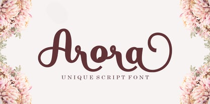 Introducing Arora Arora with a smooth handwriting style and very pretty and lovely. Arora is perfect for branding projects, home appliance design, product packaging, use in business cards, invitation cards, etc. Just like a stylish text overlay to a wallpaper or anything that needs a touch of love. Thanks for checking! I really hope you enjoy
 - Bright Aurora by Mega Type,
$12.00 INTRODUCING Bright Aurora is a fun handwritten font, Mix uppercase and lowercase for a fun and unique look! Bright Aurora is perfect for quotes, t-shirt designs, websites, branding, store brand, kids designs, svg designs, blogs, poster, logos, invitations and more! Have fun using Bright Aurora!!! Feel free to follow, like and share. Thank you very much for checking my store!
 - Aurora CW by FSD,
$50.00Strong experimental remix of a quite old typeface named Aurora. Inspired by Cornel Windlin 1990s artworks. - East Aurora by Putracetol,
$24.00 East Aurora - Bold Serif Font. East Aurora is a bold vintage style serif font with strong character and soft features. East Aurora is equipped with Swash, Stylistic and Titling alternates as well as with Standard and Discretionary Ligatures And this font ** East Aurora ** is a stylish font that is both retro and bold font. It's thick curves give a 70s groovy vibe with the serifs bringing it slightly back to traditional. Comes with alternatives and ligatures, helps to create stunning logos, quotes, posts, blog posts. branding projects, magazine imagery, wedding invitations, and much more. The alternative characters were divided into several Open Type features such as Swash, Stylistic Sets, Stylistic Alternates, Contextual Alternates, and Ligature. The Open Type features can be accessed by using Open Type savvy programs such as Adobe Illustrator, Adobe InDesign, Adobe Photoshop Corel Draw X version, And Microsoft Word. This font is also support multi language.
 - Superia Aurora by Putracetol,
$28.00 Introducing Superia Aurora - a unique and modern display font that brings a classic, fun, and trendy impression to your designs. This font features various styles, including ligatures, making it even more unique and distinct. Superia Aurora is inspired by elegant typefaces and posters with display themes, making it perfect for a wide range of display purposes, such as album covers, posters, labels, t-shirts, apparel, signage, quotes, logos, greeting cards, logotypes, and more. It also supports multi-language characters, making it accessible for designers around the world. Superia Aurora offers alternative characters that are divided into several Open Type features, including Swash, Stylistic Sets, Stylistic Alternates, Contextual Alternates, and Ligatures. These features can be easily accessed using Open Type savvy programs like Adobe Illustrator, Adobe InDesign, Adobe Photoshop, Corel Draw X version, and Microsoft Word. This allows you to customize and create unique lettering compositions that suit your design needs, giving you ample options for creative exploration. In your zip package, you'll find the Superia Aurora font files in otf, ttf, and woff formats, providing versatility for different design projects. The font includes uppercase and lowercase letters, numerals, punctuation, and symbols, ensuring that you have all the elements you need for your designs. Superia Aurora is also designed to support multi-language characters, making it suitable for designing in different languages. Whether you're creating designs in English, Spanish, French, or any other language, Superia Aurora has got you covered. In summary, Superia Aurora is a unique and modern display font that offers a variety of styles and Open Type features for customization. With its multi-language support and versatile design options, Superia Aurora is perfect for various display purposes. So, unleash your creativity with Superia Aurora and create eye-catching designs that stand out and make a statement! Thank you for choosing Superia Aurora from our collection. Happy designing!
 - Cloudy Aurora by Sarid Ezra,
$17.00 Cloudy Aurora - Font Duo | Serif & Script Cloudy Aurora is perfect combination between classic and fairy serif with signature script. Contain two fonts, the delicate modern serif and a free hand writing script. This font duo also support multilingual, number and symbol, end swash and many ligatures. Also this font already PUA Encoded.
 - Aurora Nintendo by FSD,
$2.46 Strong experimental remix at the edge of the typography of a quite old typeface called Aurora.
 - Aurora Lights by Lazy Holiday Studio,
$15.00 Aurora Lights was designed by Moon Young. Aurora Lights was inspired by album [ AURORA - URC ]. Included: -Uppercase and Lowercase -Number and Punctuation It expresses the fluid shape of the aurora. Recomended to use it on album covers and posters.
 - Ankora - Unknown license

- Quropa - Unknown license

- Aureola by OneSevenPointFive,
$20.00 Condensed Sans-Serif font family 7 widths with corresponding italics 2 free fonts (Aureola regular & italic) OpenType features
 - Autoray by PizzaDude.dk,
$16.00 Usually fonts that are related to computers, space, future are not handmade, but rather digital made. Autoray is 100% handmade, and I am not sure which category it fits in. It has this futuristic and intergalactic look, but at the same time the handmade details are pointing in a more grafitti and comic way. I will let you decide where to go with Autoray! I have added 5 different versions of each letter, and they automatically changes as you type - and of course, there's multilingual support - and even intergalactic gravity! :)
 - Allora by Etewut,
$30.00 Allora is a serif based typeface with three font styles: regular, display, hair and double. Mix them as you want: integrate Allora to your website, create mobile app or just make an awesome print. Enjoy it!
 - Arroba by Jonahfonts,
$35.00
- Auriga by Typehill Studio,
$14.00 Preview Text The quick brown fox jumps over the lazy dog Auriga Example 1 of Font More information about this Font Auriga is a calligraphy script font that comes with beautiful alternative characters. a mixture of copper calligraphy with handleting style. Designed to bring style elegance. Auriga attracts such a subtle, clean, feminine, sensual, glamorous, simple and very readable typeface. The classic style is perfect to apply in various formal forms such as invitations, labels, menus, Logos, fashion, make up, stationery, letterpress, romantic novels, magazines, books, greeting / wedding cards, packaging, labels. Auriga has 671 glyphs. including multiple language support. With OpenType features with stylish alternatives, ligatures and characters, allowing you to mix and match pairs of letters to fit your design, as well as a touch of ornament to make this font look elegant. To install fonts follow these simple steps: .Open the zip folder you downloaded. .Double-click on the font as if you were opening an application. .Now the font installation window will open. .Click Install and wait for it to finish. .You have now installed the font. .Be sure to restart your application (and if that doesn't work restart your computer).
 - Ancora by Ixipcalli,
$30.00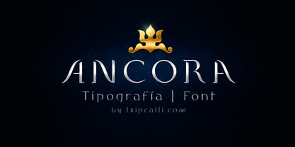
- Kuroga by Grontype,
$10.00 Kuroga is a captivating and distinctive handwriting font that effortlessly blends artistry with legibility. Every stroke of this unique typeface exudes personality and charm, making it stand out in the realm of handwritten fonts. The letters flow seamlessly, creating a rhythmic and organic appearance that mimics the natural ebb and flow of handwriting. Kuroga is Perfect for quotes, packaging, cards, posters, stickers, social media posts and more! Features: Unique Swash Basic Latin Glyphs Uppercase and Lowercase Letters Ligatures & Alternate Numeral and Punctuation Multilingual Support Thankyou for picking up this font, hope you enjoy it. Regard, grontype
 - Andora by Letterara,
$12.00 Introducing Andora, a beautiful, full-featured modern calligraphic font with tons of alternate characters and OpenType features. Andora hand-lettered is particularly well-suited for invitations, branding and editorial design. Perhaps the most fun thing about Andora is that it includes multiple versions of all ascending and descending letters, making it lots of fun to play with layouts and compositions. The OpenType features can be very easily accessed by using OpenType-savvy programs such as Adobe Illustrator and Adobe InDesign.
 - Angora by Omotu,
$18.00 Angora! A handwrittent signature font. Angora font is suitable for branding, logotype, apparel, T-shirt, Hoodie, product packaging, quotes, flyer, poster, advertising, etc. Whats Include? Uppercase and lowercase characters Supports international languages Opentype feature: ligatures Accessible in the Adobe Illustrator Glyphs panel, or under Stylistic Alternates in the Adobe Photoshop OpenType menu, Adobe InDesign, Corel Draw, even work on Microsoft Word Please message me if you’re unsure of any language support. Thanks for looking, and I hope you enjoy it! Please don’t hesitate to drop me a message if you have any issues or queries.
 - Ancora by FAEL,
$20.00 I’m happy to announce the complete version of Ancora, a typeface I designed back in 2013. Ancora is a sans serif typeface with a distinctive style, inspired by the imagery in the production of the famous Port wine, such as boats, barrels, grapes, and bottle labels. Use Ancora for magazines, packaging, posters, stamps, brands and logos a new taste.
 - ML Tokyo Aurora by Supfonts,
$18.00 Hi ! I just now launch my new font Family called "Tokyo Aurora". The Tokyo Aurora font is a simple font, comes with alternate symbols and some ligatures. I wanted this font looks elegant, readable, stylish, and catchy. You can use this font for watermark on photography, signature or signature logo design, quotes, album cover, business card, and many other design project.
 - Aurore Grotesque by Device,
$39.00 Aurore Grotesque is an elegant, robust geometric sans for both text and headline. It has a classic European heritage that references the posters of Cassandre and the modern sans of Paul Renner or Karl Gustav Möhring, but is entirely new and does not slavishly follow any historical reference. The low lower-case x-height gives it character and definition in running text, while the capitals-only Titling variant lends weight and punch to headlines. The full range of weights, each with matching italics, make it perfect for brochures, magazines, advertising, web, app and corporate uses. Includes lining, old-style and tabular numerals, arrows, stylised geometric alternates, and a full international character set.
 - Burra by Creativemedialab,
$18.00 Introducing Burra, a Variable display font. All capital alphabet with a wavy psychedelic look. Inspired by liquify and water strokes. Burra Consists of 3 widths and 5 weights on each, a total of 15 fonts. It is Variable font, officially known as Open-Type Font Variations. You can generate lots of width and weights with the two available slider axis. Burra will add fresh fun vibes to your designs. This font is perfect for clothing, book covers, titles, etc.
 - Autor by Latinotype,
$29.00 Autor is a medium-contrast sans serif font with a dynamic stroke modulation. Its clean look and angled terminals give your designs a ‘sharp’ and contemporary feel. Autor Family comes in 7 weights, ranging from Thin to Black, with matching italics, resulting in a total of 14 styles. Autor is well-suited for editorial design, body text in books and magazines, headers and titles. It can also be used—as a display font—for logotypes, branding, advertising and publishing. The font includes a character set containing more than 400 glyphs that support over 200 languages.
 - Amora by Jen Wagner Co.,
$19.00 Amora is a messy, feminine, carefree script that is perfect for logos, posters, signage, and more! Fonts I paired with in the samples are Adobe Caslon, Proxima Nova (both available through www.typekit.com) and Bebas Neue. Comes with 79 ligatures for a totally unique hand-written feel! Includes: Upper + Lowercase Letters w/ alternates Non-English support 79 Ligatures Best for: Logos Branding Large format writing Feminine look + feel Paired with sans serifs (Proxima Nova, Bebas) and classic serifs (Adobe Caslon, Baskerville) Web headers Signage Wedding invitations and decor (table numbers, signage, balloons, etc.) Not best for: Small printing Long quotes (generally flows better with just a few words) Patterned backgrounds
 - Arona by Peninsula Studioz,
$4.99 Arona is a modern geometric sans typeface tailored to elevate all your design projects, from UI and app design to web design, branding, posters, magazines, infographics, packaging, and beyond. With its sharp yet rounded strokes, Arona effortlessly radiates both professionalism and friendliness. Boasting 12 font weight variations, Arona excels in delivering a multi-level content hierarchy in your design, ensuring your value is communicated clearly and easily. Key features: Extended language support Small capitals Mathematical symbols Currency symbols Alternate stylish letters Directional arrows Fraction support Special ligatures Numerator and Denominator support
 - Alora by VP Creative Shop,
$14.00 Introducing Alora - serif typeface - 4 fonts Alora is elegant and fragile typeface loaded with 4 fonts and multilingual support. It's a very versatile font that works great in large and small sizes. Alora is perfect for branding projects, home-ware designs, product packaging, magazine headers - or simply as a stylish text overlay to any background image. FEATURES Uppercase, lowercase, numeral, punctuation & Symbol Regular Style 1 and 2 Italic Multilingual support No special software is required to type out the standard characters of the Typeface. Canva friendly Feel free to contact me if you have any questions! Mock ups and backgrounds used are not included. Thank you! Enjoy!
 - Quropa Hollow - Unknown license

- Europa Text by Solotype,
$19.95This circa 1910 European face was introduced into the United States by a German type foundry traveling salesman during the great depression of the 1930s. We have used it quite successfuly in sizes as small as 10 and 12 point. - Hebrew Europa by Samtype,
$125.00 Beautiful font, good for posters, books, and folders. This is a complete font with all diacritic marks (Nikud and Taamim) and also Shevana, Kamatz Katan, Dagesh Chazak and Holam chaser.
 - Double Aunofa by Konstantine Studio,
$13.00 Double Aunofa, a couple of beautiful fonts with the approach to luxury branding and classy feels. Comes in clean tall serif and handwritten script style. Perfectly fit for your simple branding, logo, classy visual identity, you name it.
 - Aldora Style by Sensatype Studio,
$15.00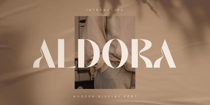 A Modern Elegant Display Font that we created special for elegant and Fashion branding needs, with extra characters alternate in unique shape will be ready to add value of your brand. It so nice to leverage designer or product owner that need solutions to make their design look more classy and modern. And specially for this font, We prepared any alternate characters to help you create unlimited variations for your creative needs. Aldora Modern Display font ready with: Any options to get creative variations (combination of Any Alternates) Preview as a inspirations that you can do with Aldora font Ready with Lowercase and Uppercase characters Wish you enjoy our font. :)
 - TC Europa by Monotype,
$29.99Europa gives a rectangular appearance to words. Strokes have lightly flaired terminals to give the effect of serifs. The Europa font is excellent for headlines in journals. - Europa Grotesque by Red Rooster Collection,
$49.00 Europa Grotesque is a condensed sans serif font family that was originally designed by Sam Ardell (TP) in the 1950’s for the Techni-Process Collection. Steve Jackaman (ITF) acquired the rights to the TP Collection in 1991 and produced Europa Grotesque in its digital form in 1994. Europa Grotesque has impressive impact at display and subhead sizes, and its geometric forms sustain that distinctiveness in both all-caps and lowercase. The family is flexible and freeform enough to support both a laid-back feel while still feeling tight and controlled.
 - Andora Ardelion by Gittype,
$18.00 Andora Ardelion is a stylish and elegant new calligraphy font, suitable for designs that need both a touch of elegance and modernity. This font has a lot of swashes that can help anchor your projects in ornamental glamour.
 - Amorra Script by Zane Studio,
$15.00 Amorra Script is a classic thin font with italics style. Here you will get a beautiful classic font. This font is available in several modern rounds that can make your work look elegant, sweet and perfect. With this style, this font will be suitable for logos, branding projects, household designs equipment, product packaging, mugs, quotes, posters, shopping bags, logos, t-shirts, book covers, business cards, invitation cards, greetings card, and all the other beautiful projects. Amorra Script, including various language support. You can use this font for your work easily. Because there are many features in it. Contains complete set upper and lower case letters, punctuation, numbers, and multilingual support. This font also includes several ligaments and alternatives Style Set Style For those of you who have good software OpenType function (Corel Draw / Photoshop / Illustrator / InDesign). If you don't have a program that supports the OpenType feature like Adobe Illustrator and the CorelDraw X version, you can access all alternatives glyphs use Font Book (Mac) or Character Map (Windows): How to access all alternative characters using Adobe Illustrator: https://www.youtube.com/watch?v=XzwjMkbB-wQ How to access all alternative characters, using Windows Character Map with Photoshop: https://www.youtube.com/watch?v=Go9vacoYmBw Thank you & Congratulations on the Design
 - La Belle Aurore - Personal use only


Page 1 of 9Next page