576 search results (0.005 seconds)
  1. Aldine 721 by Bitstream, $29.99
  2. Swiss 721 by Bitstream, $29.99
    Swiss 721™ is a sans serif family that ranges in style from thin to black while mixing in a few unexpected, but beautifully made and ironically flattering, outline weights that spice up the grotesque design. Couple these upstanding letterforms with matching italic styles and you have yourself a beautiful tool that is as legible on screen as it is off, has the technical prowess to conquer even the trickiest of design riddles and will work in a myriad of projects. Swiss 721 is a staple sans serif that you’ll never be sorry you have in your library. It’s been said that a simple sans serif is one of the most difficult typefaces to design. This is because when letters are reduced to their most basic details, irregularities and inconsistencies in design become immediately visible. The Swiss 721 typeface family is a quintessential example of letterforms distilled to their essence while still possessing warmth and verve. Based on mid-century sans serif typefaces, Swiss 721 is a versatile family of weights and proportions ideally suited to a wide variety of print and interactive design projects and is equally at home as headlines on billboards as it is navigation content on small screens. Swiss 721 takes the essence of mid 20th century sans serif typefaces and melds it with modern design consistency and a systematic weight range.
  3. Freeform 721 by Bitstream, $29.99
    Auriol font was the basis for the lettering used by Hector Guimard for the entrance signs to the Paris Metro. Bitstream’s Freeform 721 with his brush stroke look, is well-suited to display settings.
  4. Square 721 by Bitstream, $29.99
  5. 321 - Unknown license
  6. 321 - Unknown license
  7. Swiss 721 Devanagari by Bitstream, $50.99
  8. Swiss 721 WGL by Bitstream, $49.00
    Swiss 721™ is a sans serif family that ranges in style from thin to black while mixing in a few unexpected, but beautifully made and ironically flattering, outline weights that spice up the grotesque design. Couple these upstanding letterforms with matching italic styles and you have yourself a beautiful tool that is as legible on screen as it is off, has the technical prowess to conquer even the trickiest of design riddles and will work in a myriad of projects. Swiss 721 is a staple sans serif that you’ll never be sorry you have in your library. It’s been said that a simple sans serif is one of the most difficult typefaces to design. This is because when letters are reduced to their most basic details, irregularities and inconsistencies in design become immediately visible. The Swiss 721 typeface family is a quintessential example of letterforms distilled to their essence while still possessing warmth and verve. Based on mid-century sans serif typefaces, Swiss 721 is a versatile family of weights and proportions ideally suited to a wide variety of print and interactive design projects and is equally at home as headlines on billboards as it is navigation content on small screens. Swiss 721 takes the essence of mid 20th century sans serif typefaces and melds it with modern design consistency and a systematic weight range. OpenType® fonts of Swiss 721 also benefit from a rich character set and a range glyphs supporting most Western European and many Eastern European languages.
  9. Swiss 721 Hebrew by Bitstream, $29.99
  10. Gothic 821 by Bitstream, $29.99
  11. Humanist 521 by ParaType, $30.00
    Humanist 521 is a Bitstream digitized version of Gill Sans typeface. The font was designed by Eric Gill and released by Monotype circa 1928-1930. Gill’s design is based on the typeface of Edward Johnston, the innovative British letterer and teacher, designed in 1916 for the signage of the London Underground. However, it has more classical proportions close to those of old style serifs, and thus is more suitable for text setting. With distinct roots in handwritten scripts, Gill’s typeface is classified as a humanist sans serif and is very legible and readable in text and display work. Having been released more than 80 years ago, it’s still very popular and in fact is an icon of British typographic style. The Cyrillic version of Ultra Bold weight was designed by Tagir Safaev in 1997. Six text styles and Extra Bold style in Cyrillic were designed later by Vladimir Yefimov and Isabella Chaeva. The Cyrillic version, in addition to the original Bitstream implementation of Humanist 521, has an alternative numeral 1 with the traditional shape and a set of old-style figures. Rereleased by ParaType in 2013.
  12. Century 725 by Bitstream, $29.99
  13. Humanist 521 by Bitstream, $29.99
  14. Swiss 921 by Bitstream, $29.99
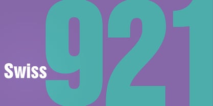
  15. Gothic 725 by Bitstream, $29.99
  16. Gothic 725 by ParaType, $30.00
  17. R21 hSq by 103cia, $10.00
    R21-h sq is stand for "Ratio 2:1 in horizontal square"; a comparison in making a glyph typography, horizontally in the form of a square. R21-h sq font consists of bold-retro typeface with its own unique funky style. Suitable for app design, games, toys character face, storybook covers, logos, advertisements, branding, poster, or anything that needs a daring and fresh typography. Font include: R21-hSq-Latin (+extended) font R21-hSq-Cyrillic font R21-hSq-Greek font* * Additional Light font for Greek only. All styles include Latin standards (except for free/demo version). The glyph 6, 8, 9, x, O, Q and X on display are for commercial version (the free/demo version are different).
  18. Freehand 521 by Tilde, $39.75
  19. Gothic 725 by Tilde, $39.75
  20. Latin 725 by Bitstream, $29.99
  21. Century 751 by Bitstream, $29.99
    The year 1914 marked the appearance of Washington Ludlow's first typograph machine. This remarkable invention permitted typesetters to quickly cast a full line of lead type in one operation using supplied brass matrices, a procedure which was for the time a major technological improvement over the usual hand-set foundry type methods. Casting type the Ludlow way necessitated the creation of an entire range of new Ludlow typefaces, a development which made Ludlow not only a major manufacturer of printing machinery, but also one of the world's leading sources of professional type design. Renowned typographers such as Douglas C. McMurtrie and Ernest F. Detterer created original faces at Ludlow's request. Robert Hunter Middleton was Ludlow's design director for over fifty years, and during his distinguished career produced an entire library of typefaces representing virtually every known typographic style. He is recognized as one of the most prolific type designers of all time. Today, new Ludlow computer fonts are in preparation, including optically-correct versions of many classic Ludlow typefaces, drawn directly from the originals in the Ludlow company library.
  22. Century 731 by Bitstream, $29.99
  23. Flareserif 821 by Tilde, $39.75
  24. Gothic 720 by Bitstream, $29.99
  25. Calligraph 421 by Tilde, $39.75
  26. Monospace 821 by Bitstream, $29.99
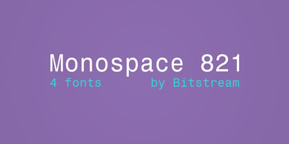
  27. Calligraphic 421 by Bitstream, $29.99
  28. Transitional 521 by Bitstream, $29.99
  29. News 701 by Bitstream, $29.99
  30. Freehand 521 by Bitstream, $29.99
  31. Flareserif 821 by Bitstream, $29.99
  32. Zapf Elliptical 711 by ParaType, $30.00
    The Bitstream version of Melior, a twentieth century modern face commissioned by Stempel and designed by Hermann Zapf in 1952. It is based on Zapf’s thoughts about the squared-off circle known as a super-ellipse. The type was originally intended as a newspaper text face by Linotype. Hermann Zapf’s Melior exhibits a robust character through classic and objective forms. Versatile and extremely legible, it can be used for a variety of texts and point sizes. Cyrillic version was developed by Natalya Vasilyeva and licensed by ParaType in 2002.
  33. Zapf Elliptical 711 by Bitstream, $29.99
  34. Geometric Slabserif 712 by ParaType, $30.00
    The Bitstream version of Monotype Rockwell, 1934. Twentieth-century design influence is revealed in strokes of more even weight than in the original nineteenth-century Egyptians or Slab Serifs. Rockwell is a prime example of this twentieth-century approach. It seems to be a simple Constructivist geometric sans with strong square slab serifs added to. Angular terminals make its sturdy design particular sparkling. It is a strong face for headlines and posters, and is legible in very short text blocks. Cyrillic version was developed at ParaType in 2000 by Isay Slutsker and Manvel Shmavonyan.
  35. Gothic 821 Condensed by Tilde, $39.75
  36. Humanist Slabserif 712 by Bitstream, $29.99
  37. Square Slabserif 711 by Bitstream, $39.00
    A contemporary revival of early 20th century fonts, the Square Slabserif 711™ typeface family from the Bitstream library is perfect for contemporary print and interactive design projects. Its geometric structure of right angles and opposing round corners are ideally suited to current imaging devices. An added benefit is that they also give the design an enduring industrial strength demeanor. Available as three weights with relatively condensed proportions, the Square Slabserif 711 family will surely be a valuable addition to any professional collection of fonts.
  38. Monospace 821 WGL by Bitstream, $49.00
  39. Geometric Slabserif 712 by Bitstream, $29.99
  40. 21 Heads - Unknown license
Looking for more fonts? Check out our New, Sans, Script, Handwriting fonts or Categories
abstract fontscontact usprivacy policyweb font generator
Processing