22 search results
(0.003 seconds)
- 1557 Italique by GLC,
$38.00 Italic type was invented by Aldus Manutius in 1499 or 1501, first, before to be a style name, it was a plain font familly name. This Italique style font was inspired from these who was used by Jean de Tournes in Lyon (France) to print La mÈtamorphose d'Ovide figurÈe, a splendid book with numerous gothic style wood carved pictures. The original font contains almost all modern usual characters except accented ones, no longer in use on that time. They have been added, with some others, with respect for the original design. . A render sheet, enclosed in file, help to identify various others unusual letters on keyboard. It is used as successfuly as web-site titles, posters and fliers design, editing ancien texts or greeting cards, invitations, gastronomic menus... and much more, as a very decorative and elegant font... It supports easily as enlargement as small size, remaining clear and easy to read from 8 or 9 points to 72 and more, particularly on prints.
 - Revival 555 by Bitstream,
$29.99 - Staccato 555 by Tilde,
$44.75 - Staccato 555 by Bitstream,
$29.99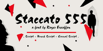
- 1557 Civilité Granjon by GLC,
$42.00 Living from 1545 in Lyon, France, the famous punchcutter Robert Granjon created a typeface that looked like his own handwriting. The first book printed with this font, in 1557, was probably Dialogues de la vie et de la mort by Innocent Ringhier. We offer the complete typeface. It is a charming font with historical forms (long s, final s and others) and many ligatures, enriched with accented letters and other characters that did not exist in the original (thorn, eth, lslash and others), and a lot of alternates that permit rich and varying typography. Warning: all characters appear with the 1500s manual blackletter old style, especially letters “e” “r” or “h” alternate and some ending forms, and may be difficult to read at first, but it quickly becomes very easy. The font contains all characters for Baltic, Western European (Including Celtic), Eastern European, Northern European, and Turkish languages.
 - Satinado by AlexBlogoodf,
$6.00 This typeface was designed specifically for your project. No matter what you create, this font is perfect for your design. A magnificent combination of lines and proportions creates a stunning and modern design. Created with passion to deliver the highest quality product. I hope that this font will help you in your work and you will create truly something unique. Latin and Cyrillic alphabets Multilingual Ligatures 555 glyphs
 - GLC Ornaments One by GLC,
$20.00 This font is a collection made with the largest part of the ornaments contained in the GLC foundry medieval and renaissance period fonts. It was made for the use of customers who wish to embellish their works without buying our complete catalog! It is used to embellish and animate as variously as web-site titles, posters and fliers design or greeting cards, all various sorts of presentations, menus, certificates, letters. It was specially drawn to accompany our medieval and renaissance fonts, like 1462 Bamberg, 1509 Leyden, 1538 Schwabacher, 1543 Humane Jenson, 1557 Italique, 1589 Humane Bordeaux, 1592 GLC Garamond and others, giving them an historical additional genuine touch...
 - 1536 Civilite Manual by GLC,
$42.00 This font was created inspired from a handwritten copy of the "Brief story of the second journey in Canada" (1535) by French explorer Jacques Cartier. It is an early "Civilité" manual style, closely looking like the "Civilité" script font carved by Robert Granjon a few years later and still strongly influenced by blackletters forms, clearly visible in the capitals or long s, d, e, f or t forms. (Look at our "1557 Civilite Granjon Pro" and the latest "1638 Civilite Manual"). It is containing Western (including Celtic) and Northern European, Icelandic, Baltic, Eastern, Central European and Turquish diacritics. Historical forms, titling alternates and the numerous lower alternates or ligatures made the font looking like a real various hand.
 - 1470 Jenson Latin by GLC,
$38.00 This family was inspired by the pure Jenson set of fonts used in Venice to print De preparatio evangelica in the year 1470. The present font contains all of the specific latin abbreviations and ligatures used in the original. Added are the accented characters and a few others not in use in this early period of printing, also small caps, these, contained in a separate file in the Mac TT version. This font supports strong enlargements as easily than small size remaining very smart, elegant and fine. Decorated letters like 1512 Initials, 1550 Arabesques, 1565 Venetian 1584 Rinceau or other fonts from GLC Foundry, can be used with this family without anachronism. If Italic style is required, we recommend the use of 1557 Italique.
 - 1467 Pannartz Latin by GLC,
$38.00 This family was inspired by the edition De Civitate Dei (by Sanctus Augustinus) printed in 1467 in Sobiano (Italy, Roma) by Konrad Sweynheym and Arnold Pannartz who was the Punchcutter. It is one of the first few “Roman style” fonts, just before the birth of Jenson’s pattern (look at 1470 Jenson Latin). The present font contains all of the specific latin abbreviations and ligatures used in the original (about 54). Added are the accented characters and a few others not in use in this early period of printing. Decorated letters such as 1512 Initials, 1550 Arabesques, 1565 Venetian, or 1584 Rinceau can be used with this family without anachronism. If Italic style is required (not yet existing in early time of printing), we recommend using 1557 Italique.
 - 1512 Initials by GLC,
$20.00 This set of initial decorated letters is an entirely original creation, drawn inspired by Italian renaissance patterns. It contains two roman alphabets : one drawn in white on black background and the other in black on white. We have included a few fleurons and decorative elements. It can be used as variously as web-site titles, posters and flyers design, publishing texts looking like ancient ones, or greeting cards, all various sorts of presentations, as a very decorative, elegant and luxurious additional font... This font supports strong enlargements remaining very smart and fine. It's prefered height is about one inch equivalent to about four lines of characters. This font may be used with all blackletter fonts, but works especially well with 1543 Humane Jenson, 1557 Italique and 1742 Civilite, without any anachronism.
 - PF Reminder Pro by Parachute,
$59.00 Use Reminder to add a homey and personal touch to your notes and messages. Whether it is a note to your loved ones or a colleague at the office, this is the typeface to use. But don't take our word for it. The applications of this typeface are endless. Since its first release back in 2003, we have seen it being used for anything from banking to automobiles. And now, with this "Pro" version you can communicate with a big part of this world in a way you always wanted. PF Reminder Pro comes loaded with 555 glyphs which support all European languages including Greek and Cyrillic.
 - Kuppa by Huh? Type Foundry,
$15.00 Kuppa is a yummy display unicase with a lot of attitude. Two styles within the Kuppa family a like brothers — look alike and still completely different. Both brothers have 555 glyphs, including alternates, ligatures, fractions and even german capital eszett and excluding Cyrillic in Basic version. Kuppa Regular is clear, powerful and will suit for menus, coffee shop and restaurant use, for magazine handwritten heads and sub-lines and even for kids books. Kuppa Fat is on the dark side — it is bizarre and wild, sometimes even hardly legible. Sometimes you won't see letters, just encrypted symbols — perfect for music posters, vinyl shops, cd covers and hip stuff.
 - 1584 Rinceau by GLC,
$20.00 This set of initial letters is an entirely original creation, inspired by French renaissance patterns used by Bordeaux printers circa 1580-1590. It contains two roman alphabets : the first of decorated letters, the second of single large capitals, all with Garamond style, and a few fleurons using the same background pattern style. Both containing Thorn, Eth, L slash and O slash. It can be used as variously as website titles, posters and flyers design, publishing texts looking like ancient ones, or greeting cards, all various sorts of presentations, as a very decorative, elegant and luxurious additional font... This font is conceived for enlargements, possibly strong ones, remaining very smart and very fine (especially decorated initials). This font may be used with all GLC Foundry blackletter fonts, but preferably with 1543 Humane Jenson, 1557 Italique, 1589 Humane Bordeaux, 1742 Civilite, 1776 Independence without any fear of anachronism.
 - 1565 Venetian by GLC,
$20.00 This set of initial decorated letters is an entirely original creation, drawn inspired by Italian renaissance engraver Vespasiano Amphiareo's paterns published in Venice circa 1568. It contains two roman alphabets : the first of large Initials, the second of small caps. Both containing thorn, eth, L & l slash, O & o slash. It can be used as variously as web-site titles, posters and flyers design, publishing texts looking like ancient ones, or greeting cards, all various sorts of presentations, as a very decorative, elegant and luxurious additional font... This font is conceived for enlargements remaining very smart and fine. The original height of the initials is at least about one inch equivalent to about four lines of characters, small caps may have the same height than the caps of the font used with, but cover two lines is better. This font may be used with all GLC blackletter fonts, but preferably with "1543 Humane Jenson", "1557 Italic", "1742 Civilite", "1776 Independence" without any fear for doing anachronism.
 - Galano Classic by René Bieder,
$30.00 Galano Classic is the display companion of the Galano Grotesque family. Like the Grotesque family, it also pays tribute to the geometric shapes of Futura, Avant Garde, Avenir and the like. However, instead of that family’s modern interpretation of the geometric genre, Galano Classic prefers to stay in the past, a tendency characterized by a moderate x-height and details like the long stretched leg of uppercase “R”, as well as the traditional shaped lowercase “g”, to mention only a few details. Galano Classic, compared to Galano Grotesque, includes lots of redesigned glyphs and consequently adjusted kerning pairs, an extended number of alternative characters, ligatures and opentype features to match a great many design applications. It comes in 10 different weights with matching italics containing 555 glpyhs per font. Although Galano Classic was planned to be the display version of Galano Grotesque, it feels great in small sizes and long text passages, too.
 - 1514 Paris Verand by GLC,
$20.00 This set of initial decorated letters was inspired by a font in use in the beginning of 1500s in Paris. Exactly, we have used the set that Barthélémy Verand employed for the printing of Triumphus translatez de langage Tuscan en François, (from “Triumph” of Petrarque) in the year 1514. Some letters, lacked, have been reconstructed to propose a complete alphabet. It appears that the printer used some letters to replace others, as V, turned over to make a A, or D to make a Q. The original font’s letters were drawn in white on a black background only, but it was tempting to propose a negative version in black on white. It is used as variously as web-site titles, posters and flyers design, publishing texts looking like ancient ones, or greeting cards, all various sorts of presentations, as a very decorative, elegant and luxurious additional font. This font supports strong enlargements remaining very smart and fine. It’s original medieval hight is about one inch equivalent to about four lines of characters. This font may be used with all blackletter fonts, but works particularly well with 1543 Humane Jenson, 1557 Italic and 1742 Civilite, without any anachronism.
 - 1510 Nancy by GLC,
$20.00 This set of decorated initial letters was inspired by those used in 1510 in Nancy (France, Lorraine) for printing of "Recueil ou croniques des hystoires des royaulmes d'Austrasie ou France orientale[...]" Author Symphorien Champion, unknown printer. There were three sorts of initials family, but only one complete and clear, except a very few characters. The printer used some letters to represent others, as V, turned over to make a A, D to make a Q, M for E, So, the reconstruction was a little less difficult. Thorn, Eth, L slash and O slash were also added. The original font's letters was only drawn in white on a black background only, but it was tempting to propose a negative version in black on white. A few letters have multiple appearance, but only the A was clear enough to be reproduced. It can be used as variously as web-site titles, posters and flyer design, publishing texts looking like ancient ones, or greeting cards, all various sorts of presentations, as a very decorative, elegant and luxurious additional font... This font supports strong enlargements revealing its fine details and remaining very smart. Its original medieval height is about one inch equivalent to about three to four lines of characters. This font may be used with all our blackletter fonts, but as well with "1543 Humane Jenson", "1557 Italic" and "1742 Civilite", without any fear about anachronism.
 - The crots by Alit Design,
$15.00 Presenting the 🎃 The Crots Typeface 🦇 by alitdesign. The Crots typeface is designed for the needs of design concepts themed about Halloween and events in October and November. The Crots font has a horror character with a character shaped like dripping blood, making the horo or Halloween themed design concept even better and unique. The Crots font also gets a bonus character of 150 Halloween-themed illustrations that make creating designs even easier. Simply by downloading The Crots font, creating a Halloween themed design is very quick and easy. The Crots Typeface is perfect for magazine cover designs, brochures, flyers. Instagram ads, Canva Design and so on with halloween and dark concepts. besides that this font is very easy to use both in design and non-design programs because everything changes and glyphs are supported by Unicode (PUA). The Crots Typeface contains 557 + 150 bonus glyphs with many unique and interesting alternative options. Language Support : Latin, Basic, Western European, Central European, South European,Vietnamese. In order to use the beautiful swashes, you need a program that supports OpenType features such as Adobe Illustrator CS, Adobe Photoshop CC, Adobe Indesign and Corel Draw. but if your software doesn't have Glyphs panel, you can install additional swashes font files.
 - Elanor by Dirtyline Studio,
$25.00 Elanor is a serif typeface inspired by Retro ’70s fonts mixed with Experimental touches. Its main features are a diagonal stress and soft curved teardrop shape terminals. It has ligatures that make it more elegant and grotesque elements that give it a modern look and make it more versatile.This typeface both impressive at display sizes and easily readable in text size, while the sharp shapes of the triangular serifs and the distinctive letter shapes show their strength in logo design and impressive editorial use. Elanor come with elegant style, Retro and contrasts, with features an extended latin character set of 555 glyphs covering over 94 languages, Latin & Cyrillic. Elanor is ready to making your projects looking classic but contemporary, finely tuned but assertive, and elegant as the best retro design. 94 languages : Afrikaans, Albanian, Asu, Basque, Belarusian, Bemba, Bena, Bosnian, Bulgarian, Catalan, Chiga, Colognian, Cornish, Croatian, Czech, Danish, Embu, English, Esperanto, Estonian, Filipino, Finnish, French, Friulian, Galician, German, Gusii, Hungarian, Indonesian, Irish, Italian, Kabuverdianu, Kalaallisut, Kalenjin, Kamba, Kikuyu, Kinyarwanda, Latvian, Lithuanian, Low German, Lower Sorbian, Luo, Luxembourgish, Luyia, Macedonian, Machame, Makhuwa-Meetto, Makonde, Malagasy, Malay, Maltese, Manx, Meru, Morisyen, North Ndebele, Norwegian Bokmål, Norwegian Nynorsk, Nyankole, Oromo, Polish, Portuguese, Romanian, Romansh, Rombo, Rundi, Russian, Rwa, Samburu, Sango, Sangu, Scottish Gaelic, Sena, Serbian, Shambala, Shona, Slovak, Slovenian, Soga, Somali, Spanish, Swahili, Swedish, Swiss German, Taita, Teso, Turkmen, Upper Sorbian, Vunjo, Walser, Zulu
 - Fushar by Mikołaj Grabowski,
$19.00 Fushar is a bold comic color font family which comes in 5 layer-styles easy to compose in a multicolor manner and 3 OpenType-SVG color styles to make the work faster and easier. Character set covers Latin alphabet of European languages, Vietnamese and Pinyin with standard ligatures, digits, punctuation, currencies and other symbols - the total of 555 glyphs. The idea came from a custom logotype I made several years ago for a local charity organisation that helps children. The logotype was based on bold letters with light that make the "balloon" effect visible in "Holes" style. Later I expanded the family with "Cuts" and all the derivative fonts that make the whole color family. The purpose was to create a funny, friendly and playful script that would embrace the beauty of the Arabic script which is available in Fushar Arabic. The Latin character set is a useful addition and is available in multilingual bundles. Solid, Cuts and Holes are classic one-color styles which can be used separately to compose a simple text. With Shadows and Lights they can produce a multicolour design, as shown on the images above. To save the time, there are three already prepared combinations in the new OpenType-SVG color format. The features include contextual alternates, standard ligatures, fractions, ordinals, case-sensitive forms, proper mark attachment, superscript (1, 2, 3) & localizations.
 - Faber Gotic by Ingo,
$21.00 A ”modern“ Gothic – designed according to principles of modern form in three variations Faber Gotik is a reminiscence of Gutenberg’s first script from around 1450. The heavily broken forms allow further development in the direction of a modern, strongly geometric and less formal type. It should be possible to push the principle of design so far to the limit that a type is created which, from the very start, extinguishes reminders of a dark past. The characters are composed of squares which are lined up straight or in a more or less slanted manner. The resulting corners similar to serifs were removed so that a sans serif type in the true sense without up and down strokes was created. The principle of ”breaking“ was applied according to the historical model. Even the form of the characters is based on the model from the Middle Ages. Only the characters which cannot be created with the principle described were modeled on today's forms. Faber Gotik includes three variations: - Faber Gotik Text — most similar to the historical model - Faber Gotik Gothic — pushes the applied principle of form the furthest - Faber Gotik Capitals —; a Gothic upper case font, contrary to tradition. 555 years after Gutenberg, interest in black-letter typefaces is nearly extinct. They are especially looked down upon in German-speaking countries because they are still associated with ”Nazi“ scripts. But yet, the very forms of blackletter, Gothic, Schwabacher and especially cursive have enormous potential with regard to the development of new advanced font forms.