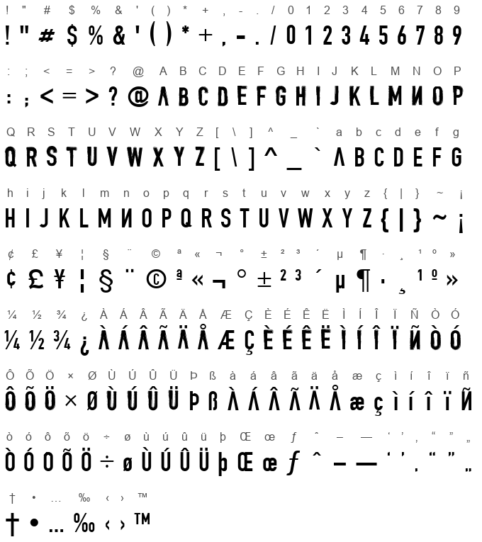
As of my last update in April 2023, I must note that there might be limited direct information widely available about a specific font called "DENIAL" by Patrick Dehen, making a comprehensive description challenging without direct access to the font or detailed primary sources. However, I can conjecture and provide an illustrative overview based on typical considerations in font design and the thematic implications of its name, tailored to what one might expect from a font named "DENIAL."
The name "DENIAL" itself suggests a font that could embody resistance, contradiction, or a subversion of expectations. A designer like Patrick Dehen might choose this name to evoke a specific emotional or philosophical stance, possibly reflecting on societal, personal, or artistic themes of denial. The design of the font could thus play with these concepts visually.
One might imagine "DENIAL" to feature strong, perhaps even rigid, lines that assert themselves on the page, offering a bold statement. Conversely, it could employ unexpected breaks or gaps in those lines, symbolizing the concept of denial or a break from reality. The font could balance between assertiveness and elusiveness, capturing attention not just with its presence but with what is missing or what it refuses to conform to.
Moreover, considering the artistry involved in font design, "DENIAL" could incorporate elements that challenge traditional font aesthetics. This could mean unconventional letter shapes, unexpected angles, or a unique interplay between positive and negative space. The font might also play with scale and proportion, denying viewers the comfort of predictability.
In terms of practical application, a font with such thematic depth would be well-suited for projects that aim to provoke thought, evoke strong emotions, or make bold statements. It could find its place in artistic exhibitions, avant-garde publications, or promotional materials for causes or products that aim to disrupt the status quo.
Without seeing "DENIAL" firsthand, one can only imagine the multitude of ways Patrick Dehen could visually manifest the concept of denial into a tangible typographical form. Whether through stark minimalism, complex abstraction, or bold defiance of typographic norms, "DENIAL" promises to be more than just a set of characters—it's a statement, a story, and an exploration of what it means to deny and be denied.
Character map

Characters
! " # $ % & ' ( ) * + , - . / 0 1 2 3 4 5 6 7 8 9 : ; < = > ? @ A B C D E F G H I J K L M N O P Q R S T U V W X Y Z [ \ ] ^ _ ` a b c d e f g h i j k l m n o p q r s t u v w x y z { | } ~ ¡ ¢ £ ¥ ¦ § ¨ © ª « ¬ ° ± ² ³ ´ µ ¶ · ¸ ¹ º » ¼ ½ ¾ ¿ À Á Â Ã Ä Å Æ Ç È É Ê Ë Ì Í Î Ï Ñ Ò Ó Ô Õ Ö × Ø Ù Ú Û Ü Þ ß à á â ã ä å æ ç ì í î ï ñ ò ó ô õ ö ÷ ø ù ú û ü þ Œ œ ƒ ˆ – — ‘ ’ ‚ “ ” „ † • … ‰ ‹ › ™
Languages
CommentsFollow
No comments. Be the first one!


